Blog

Nov
Energy helps makes the world turn. Maybe that why every state in our country produces it; however, not all energy is equal when it comes to being green and environmentally friendly. Reddit user Dr_Engineerd shared a map of the United States. Specifically, the map details the percentage of electricity produced by non-fossil fuel sources. The data comes from U.S. Energy Information Administration. Let’s take a closer look at the map!
The Non-fossil Fuel Energy Map
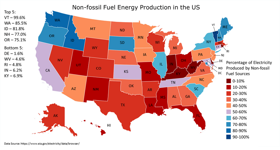
Each state on the map is depicted by a certain color. The redder states are those which have a low percentage of non-fossil fuel energy production. The bluer states, on the other hand, of those which have a higher percentage of non-fossil fuel energy production.
Most of the states in the Midwest, with the exception of Illinois and South Dakota, lean towards the red end of the color spectrum. This means the electricity of those states is produced by a higher amount of fossil fuel energy. The northern states on both coasts trend bluer. The electricity there is produced by more non-fossil fuel energy.
Highest and Lowest States by Percentage
A cursory glance at the map will give you an idea where each state stands. After all, the color of the state indicates the type of fuel sources it uses (fossil fuels versus non-fossil fuels). To get a better idea of fuel sources, it’s best to get the actual percentage of electricity produced by non-fossil fuel sources. Below are the states which have the most, and least, percentages of electricity produced by non-fossil fuel sources.
Top 5 non-fossil fuel states:
- Vermont (99.6%)
- Washington (85.55%)
- Idaho (81.8%)
- New Hampshire (77%)
- Oregon (75.1%)
Bottom 5 non-fossil fuel states:
- Delaware (1.6%)
- West Virginia (4.6%)
- Rhode Island (4.8%)
- Indiana (6.2%)
- Kentucky (6.9%)
Comments and Thoughts
Reddit user Dr_Engineerd explains the types of non-fossil fuel energy sources. Solar, wind, biomass, geothermal, and hydroelectric are common types of green energy. Nuclear energy also falls into this category in part because it’s emission-free.
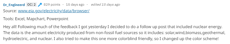
Dr_Engineerd also shared what the map would look like without including nuclear. See it below.
![]()
Another Reddit user, jswynn5, has an interesting take on the energy product of Texas. Jswynn5 writes, “Side note, I used to live in Texas, they are the largest wind energy producers in the US. Unfortunately it doesn’t come close to how much fossil fuel energy they produce. Just interesting facts”.

Featured photo by Pixabay on Pexels
Non-fossil fuel energy map and Reddit comments are screenshots by RPS Relocation
Comments
Most Recent Blog Posts
 A Dallas Area Home Buyer Had to Pay $300,000 More Than Asking Price For Their New Home22 May, 2021
- Canada's Home Prices Have Risen 168.4% Since 2000, USA Home Prices Have Risen 54.99%01 Apr, 2021
- Home Prices in Seattle Are Skyrocketing12 Mar, 2021
- Seattle Among Best Cities for Startups08 Jul, 2019
- Renters in Chicago and New York are fleeing south for Dallas24 Jun, 2019