Blog
Apr
Canada’s Home Prices Have Risen 168.4% Since 2000, USA Home Prices Have Risen 54.99%
Jason C. 0 comments Data Visualization, Home Ownership
[OC] Where have house prices risen the most since 2000? from dataisbeautiful
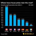
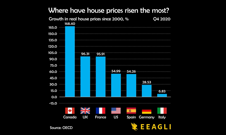
A datavisualization from Reddit user Jcceagle shows how home prices in several countries in North America and Europe have changed since the year 2000. The data comes from the Organisation for Economic Co-operation and Development and has been adjusted for inflation.
Canada came in at the #1 biggest change rising 168.4% bewteen 2000 and 2020.
Here are all of the countries home prices included in the graphic
- Canada – 168.4%
- United Kingdom – 96.31%
- France – 95.91%
- United State – 54.99%
- Spain – 54.26%
- Germany – 28.53%
- Italy – 6.83%
Home prices rise for a variety of reasons including foreign investors buying property, homes being purchase for vacation or short-term rentals, and various other factors. It is clear from the this graphic htat some countries are experiencing major problems controlling the factors that contribute to exorbidant rises in home prices.
This is a ‘bar chart race’ data visualization which means you can watch the figures change over the 20 year time span and see precisely when each country’s home values experienced major rises.

Mar
Most New Apartment Buildings in the USA Are Considered High-End
Jason C. 0 comments Dallas, Data Visualization, Seattle
Good news for renters: Most new apartment buildings in 2017 are considered high-end. This trend continued in 2018 and will likely be a feature of new apartment complexes in 2019 as well. RENTCafé put together the numbers and even went city-by-city to show how luxury apartments are taking over. Let’s see what they found!
The Trend is Luxurious
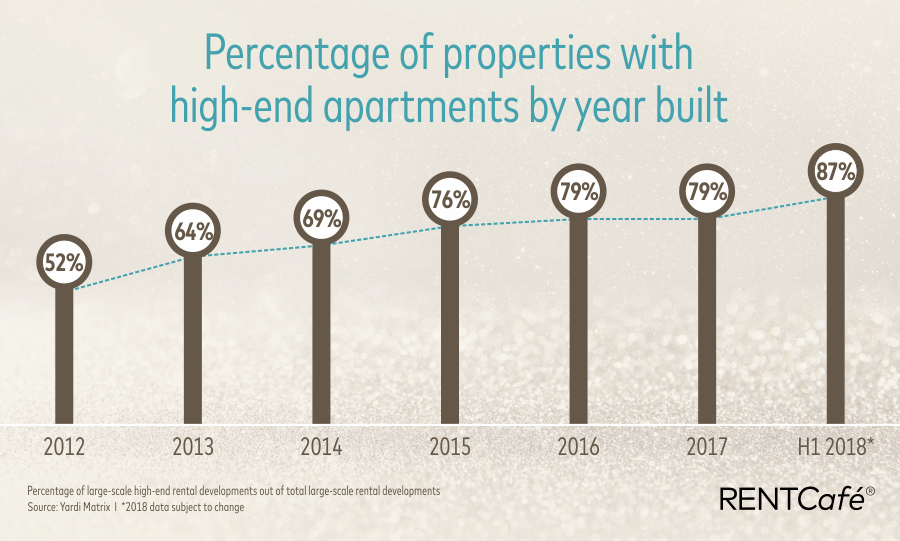
Nadia Balint of RENTCafé writes, “Encumbered by high construction costs and encouraged by a surge in demand for rentals, developers have bet big on luxury apartments. Back in 2012, high-end properties represented about half of all newly completed construction, but now these projects occupy the lion’s share of the multifamily industry. Of the 1,600 large-scale apartment buildings completed in 2017 in the U.S., 1,270 (or 79%) classify as high-end properties”.
To put this into better perspective, let’s take a look at the percentage of properties with high-end apartments by year built. They are:
- 2012: 52%
- 2013: 64%
- 2014: 69%
- 2015: 76%
- 2016: 79%
- 2017: 79%
- 2018: 87%
And there you have it. The percentage of new, luxury apartments can’t get much higher than that! Let’s take a look at a visualization of this growth in luxury apartments. Check out the photo below.
Dallas, Seattle, and Las Vegas
The percentage of new, high-end apartment buildings can’t get much higher than 87%. But they can in Las Vegas! Nadia Balint continues, “The luxury market is also thriving in Las Vegas metro — where 100% of the apartments built in 2017 were high-end — boosted by Californians moving to Vegas in greater numbers and the area’s great economic outlook.”
The luxury apartment market is thriving in Dallas-Fort Worth and Houston as well. In Dallas-Fort Worth, a massive 98% of all new apartment buildings were high-end in 2017. Houston was just behind Dallas-Fort Worth. In 2017, 97% of their new apartment building were high-end.
Seattle wasn’t very close to Las Vegas, Dallas-Fort Worth, or Houston; however, the percentage of new, luxury apartment complexes isn’t bad their either. Case in point: 67% of the construction of new apartments in Seattle were high-end in 2017. In 2018, that number stayed the same. Back in 2015, however, the percentage of high-end, new apartment buildings was 72%. This is a slight decrease but it’s nothing to worry about if you’re a luxury apartment developer.
Methodology of Collecting the Data
How did RENTCafé get these numbers? How did get put together visualization above? The data comes from Yardi Matrix which, by the way, is RENTCafé’s “sister company”.
To define what’s luxurious or not, Yardi Matrix makes use of discretionary and high mid-range asset class categories. It’s important to note that “The regions and metro areas included in this report are defined as per Yardi Matrix’s market boundaries and may be different from the regional boundaries and metropolitan statistical areas as defined by the U.S. Census.”
Moving to Dallas, Seattle, or Las Vegas
Are you interested in moving to one of these cities? Are you a renter or plan to rent once you get there? Good news! You’ll be able to live in one of these new, luxurious apartment complexes if you want to. Allow RPS Relocation to help you started on decided to move.
Get a free moving quote for Dallas, Seattle, or Las Vegas today!
Featured photo by Expect Best on Pexels
Luxury apartment photos from RENTCafé are screenshots by RPS Relocation

Feb
The crime rates in Dallas are decreasing. And that’s something to be celebrated! Numbers and statistics alone can be quite bland; however, plugging the numbers into various types of visualizations brings the numbers to another level. That’s exactly what Robert Mundinger has done. Robert—a resident of Dallas—shared numerous data visualization photos in a Medium article.
Dallas Crime is Decreasing
The numbers don’t lie: Crime is going down in the city. As a matter of fact, “the murder rate in Dallas has plummeted more than any other major city over the past 30 years”, writes Robert. These numbers are shown in the chart below.
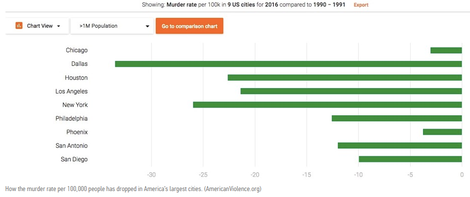
As you can see, the murder rate is decreasing the most in Dallas, followed closely by New York City and then Houston.
Let’s take a look at the overall crime rate in Dallas. The next visualization shows the crime rates in major cities per 100,000 people. Robert writes, “Dallas is quite safe despite its large size. We have the 4th largest population on this list, but are 38th on the list in total crimes committed.” Check out the photo below (Dallas is at the bottom).
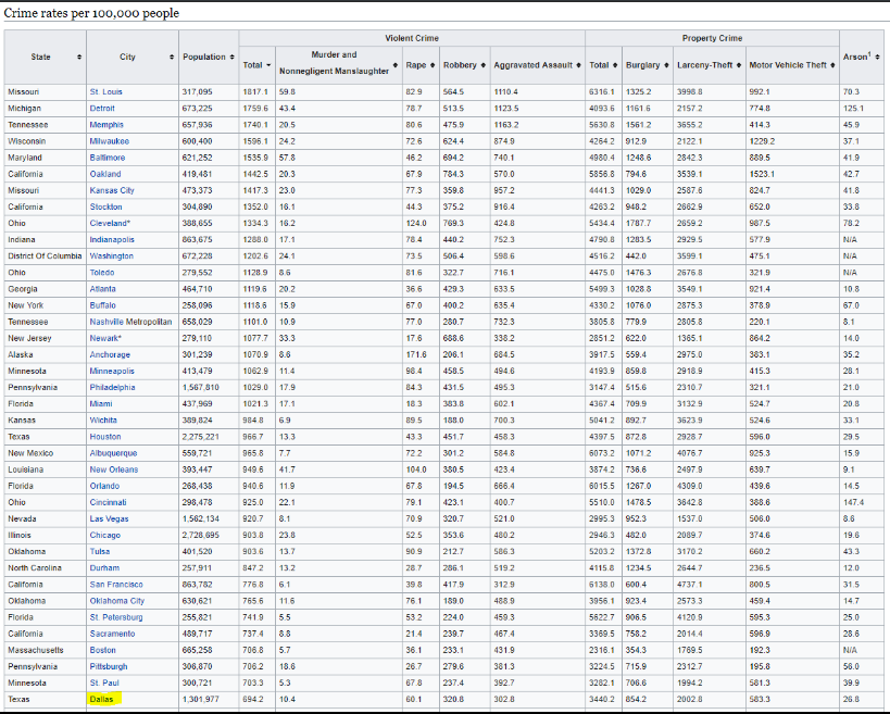
The general crime rate in Dallas is far below many other major cities. Even some lesser known major cities—St. Petersburg, Stockton, Durham—have higher crime rates than Dallas.
TheMap, by Robert Mundinger
The name Robert Mundinger may sound familiar to you. He’s the same person who created TheMap: a data visualization tool that displayed critical data for a specific, geographic area. We published an article about TheMap last November. Make sure you check it out!
Dallas continues to become a better and better place to live. And the low crime rate is only one of many features the city offers. If you’re interested in moving to Dallas, visit our Moving Quote for Dallas page to see how much it will cost.
Featured photo by skeeze on Pixabay
Dallas crime statistic photos are screenshots by RPS Relocation
Dec
Most Expensive Cities for Commuting in the USA
Jason C. 0 comments Dallas, Data Visualization, Maps, Moving News, Seattle
What’s your daily commute like? If you live in or near a major city, traffic is probably a fact of life. Back in August, we shared how much time people of major cities waste over the course of their lives by commuting. The data was put together by EducatedDriver.org. Now, they’re back with more information about your commute; however, this time, they share how much money you spend on gas and vehicle maintenance.
Recall that the average American spends about 408 days commuting. That’s over an entire year of their life driving! In addition to spending time, people also spend money as they drive. Alex Lauderdale writes, “We did the math for nearly 100 major US cities, and found the average American will spend $108,727 on gas and vehicle maintenance costs associated with commuting while driving 173,203 miles to and from work in their lifetime. That’s enough miles to drive around the world 7 times!”
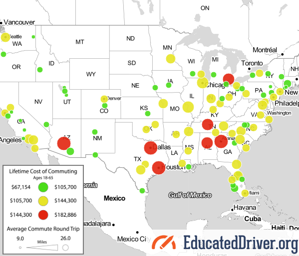
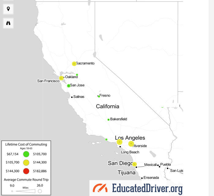
Lifetime Cost of Commuting Map

A quick glance at the map above shows this: red, yellow, and green circles. The circles represent the lifetime cost of commuting in a certain city. The red circles indicate the most expensive cities, the yellow circles indicate more of the average-costing cities, and the green circles indicate cities that are least expensive for commuting.
The lifetime cost of commuting is most in Atlanta. The average round-trip there is 26 miles and the average cost of commuting there is a whopping $182,886. Let’s take a look at some other areas.
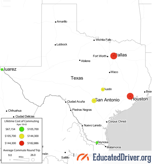
Texas has six cities on the map: Dallas, Houston, San Antonio, Austin, El Paso, and McAllen. Texas is the only state that has two large red circles which cover Dallas and Houston. Check out a photo of Texas below.
California is the state with the most cities on the map. The ten circles cover the following cities: Sacramento, Stockton, San Francisco, San Jose, Fresno, Bakersfield, Oxnard, Los Angeles, Riverside, and San Diego. We often hear about how bad the traffic can be in Los Angles; however, the city has a yellow circle. As a matter of fact, California has no red circles at all. See the photo of the state below.
Top 30 Expensive Cities for Commuting
Where are the most expensive cities for commuting? You have to click each circle to determine exactly how expensive the city is for commuting. To make better sense the map, we turned a large part of the data into a list.
Below, you’ll find the top 30 most expensive cities for commuting. As stated earlier, Atlanta is the most expensive, followed closely by Dallas, Houston, and Phoenix. Check it out as the list goes from most expensive to least:
- Atlanta, GA – $182,886
- Dallas, TX – $174,314
- Houston, TX – $174,314
- Phoenix, AZ – $162,883
- Nashville, TN – $157,168
- Detroit, MI – $148,595
- Birmingham, AL – $144,309
- Chicago, IL – $142,880
- St. Louis, MO – $142,880
- Charlotte, NC – $138,594
- Minneapolis, MN – $135,736
- Indianapolis, IL – $131,450
- Orlando, FL – $130,021
- Knoxville, TX – $130,021
- Washington, DC – $130,021
- Jacksonville, FL – $130,021
- Riverside, CA – $130,021
- Seattle, WA – $128,592
- Columbia, SC – $128,592
- Kansas City, MO – $127,163
- Memphis, TN – $127,163
- San Antonio, TX – $125,734
- Los Angeles, CA – $125,734
- Jackson, MS – $124,306
- Richmond, VA – $124,306
- Cincinnati, OH – $124,306
- Austin, TX – $122,877
- Baltimore, MD – $122,877
- Columbus, OH – $122,877
- Miami, FL – $122,877
The Methodology of the Map
How did EducatedDriver.org come up with the data used to compile the map? Alex Lauderdale writes, “For the purposes of this study, we assumed the average person starts full-time work at 18 (some people start earlier, others a bit later). We also know the average retirement age is 63 in the United States. That works out to a total of 45 years working a full-time job.”
This tells us that the data isn’t precise; however, it’s essentially as estimate based upon common knowledge such as the average retirement age and total years the average person works.
Alex continues, “From there, we operated based on the assumption most people work about 250 days per year, accounting for 2 weeks yearly vacation and time off. That adds up to a whopping 11,250 days of working/commuting over a career.”
Again, we’re seeing best estimates based upon data averages. Not everyone has exactly 2 weeks of vacation each year. Some people have more vacation than that and not everyone uses all of their vacation days.
Finally, Alex pulled data about the average round trip distances as well as how much it costs per mile to drive a vehicle. He writes, “we used data from the US Census Bureau on average daily round trip commute distances as well as data from AAA on the total cost per mile of operating a vehicle (60.8 cents per mile for the average sedan when gas, insurance, and maintenance costs are considered).”
How does your city commute compare with the rest of the country? Do you live near a red, yellow, or green circle? We’re interested in your experience and want to know if it lines up with the data! Use the comments area below to share your story.
Map photos are screenshots by RPS Relocation

Dec
The United States has one of largest land masses of any country in the world. Our country has vast mountains, plains, deserts. Puerto Rico—a territory of the United States—is home to the only tropical rain forest in North America. What is all of this land used for? Bloomberg pulled data from a number of sources to determine to answer this question.
Sure, a percentage of land is allotted for residential or business use. With the amount of traffic in some areas, it can seem as if our country is overpopulated; however, as Bloomberg learned from the data, that’s not the case.
Six Land Types
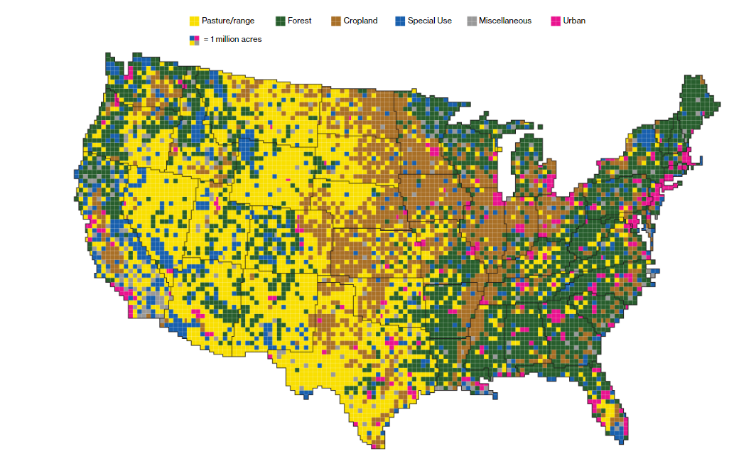
Bloomberg authors Dave Merrill and Lauren Leatherby write, “Using surveys, satellite images and categorizations from various government agencies, the U.S. Department of Agriculture divides the U.S. into six major types of land. The data can’t be pinpointed to a city block—each square on the map represents 250,000 acres of land. But piecing the data together state-by-state can give a general sense of how U.S. land is used”.
These six land types are:
- Pasture/range
- Forest
- Cropland
- Special Use
- Miscellaneous
- Urban
The map clearly shows urban areas are a minority compared to the rest, just by looking at the colored squares. Miscellaneous and special use areas have fewer squares than forest, cropland, or pasture and range zones. Bloomberg was able to collect the acreage for each land type.
Acreages of the Land Types
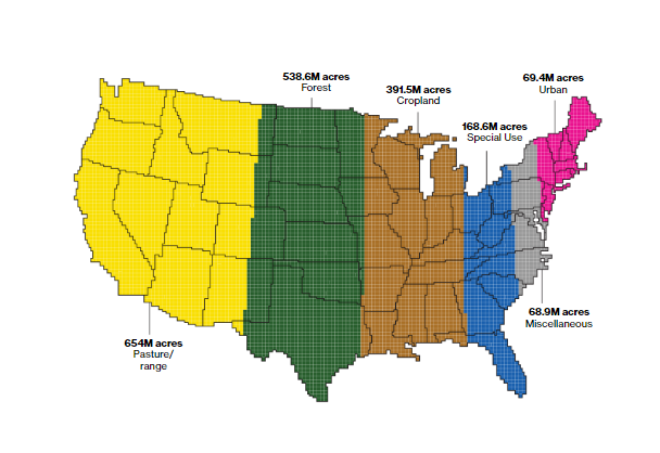
Imagine if you were able to view each land type together on the map. That’s what you get in the photo above. Here, it’s proven that urban areas are indeed the smallest and pasture and ranges are the largest. How many acreages does each land type contain? Here’s the breakdown:
- Urban: 69.4M acres
- Miscellaneous: 68.9M acres
- Special Use: 168.6M acres
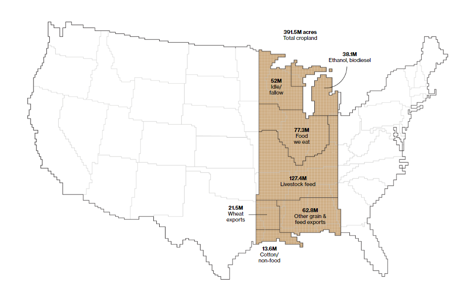
- Cropland: 391.5M acres
- Forest: 538.6M acres
- Pasture/range: 654M acres
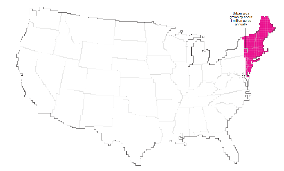
“Four in five Americans live, work and play” in urban areas, write Merrill and Leatherby. Given this fact, most Americans would be able to fit in a relatively small area of the country, in theory. Urban areas are growing quickly, however. Merrill and Leatherby continue, “The U.S. is becoming more urban—at an average rate of about 1 million additional acres a year. That’s the equivalent of adding new urban area the size of Los Angeles, Houston and Phoenix combined. U.S. urban areas have more than quadrupled since 1945”.
Food Production and Land
Around one-fifth of the land in our country is agricultural land and most of it is located in the Midwest. However, only a small percentage of agricultural land is currently used to feed Americans. Some of the land is used for ethanol production or livestock feed. Other land is used to cultivate crops with the goal of exporting them to other countries. Here’s a breakdown of what our cropland is used for:
- Livestock feed: 127.4M acres
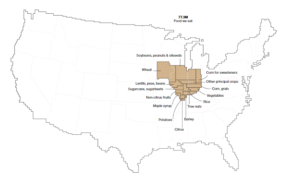
- Food we eat: 77.3M acres
- Other grain & feed exports: 62.8M acres
- Idle/fallow: 52M acres
- Ethanol, biodiesel: 38.1M acres
- Wheat exports: 21.5M acres
- Cotton/non-food: 13.6M acres
Here’s a photo of this data visualized:
Let’s zoom in on the food we eat. In the photo below, you can see wheat, non-citrus fruits, vegetables, rice, sugarcane, and a few other types of foods. Wheat, soybeans, peanuts, and oilseeds appear to be about half of what we eat. Barley, maple syrup, potatoes, and citrus are among the least of what we consume.
Featured photo by CC0 Creative Commens on Pixabay
Bloomberg data map photos are screenshots by RPS Relocation

Nov
Dallas Map Startup Shows Critical Data in One Place
Jason C. 0 comments Dallas, Data Visualization, Maps
Knowledge is power! And in our Information Age, data is the new form of knowledge. This data is being used to make humanity better. Technological advances are moving at the speed of Moore’s Law which sees computer power doubling every two years.
Data can be used to improve the lives of people at the federal, state, and local levels. One of the ways to determine where data will encourage positive action is to actually see the data. This can be accomplished by creating a data visualization on a map.
For Dallas, Texas, this such data visualization has become a reality. A substantial number of data sets have been collected with the goal of making the city better. This visualization is called TheMap. D Magazine gives us some background of how the map came to be.
Improving Dallas with a Map
Robert Mundinger, a longtime resident of Dallas, noticed problems in the areas he lived in. Matt Goodman of D Magazine wanted to learn more about TheMap from Mundinger.
Matt writes, TheMap is “an open-source, interactive web portal that allows users to access an array of data sets that can help people better understand all sorts of things about Dallas. The data sets can be used to generate maps. It’s all exportable. “A kid’s educational outcome is dependent on education and crime and health and access to food, access to internet, libraries,” Mundinger says. “All these variables affect each other so much that there needs to be one place where people can look at them together and analyze them.”
What Mundinger wants to achieve in simple: Highlight at-risk areas of the city. In addition, and while he was at it, Mundinger went ahead and included more data set that might be of use.
There are neighborhoods in Dallas which have a high concentration of poverty. This is included in the map visualization. There are intersections that have more fatal pedstrian crashes than others. This is also included in TheMap. There’s even data about where there are working females over the age of 16. The information contained within TheMap is comprehensive!
Let’s take a closer look at the data sets available for viewing.
Data Sets in TheMap
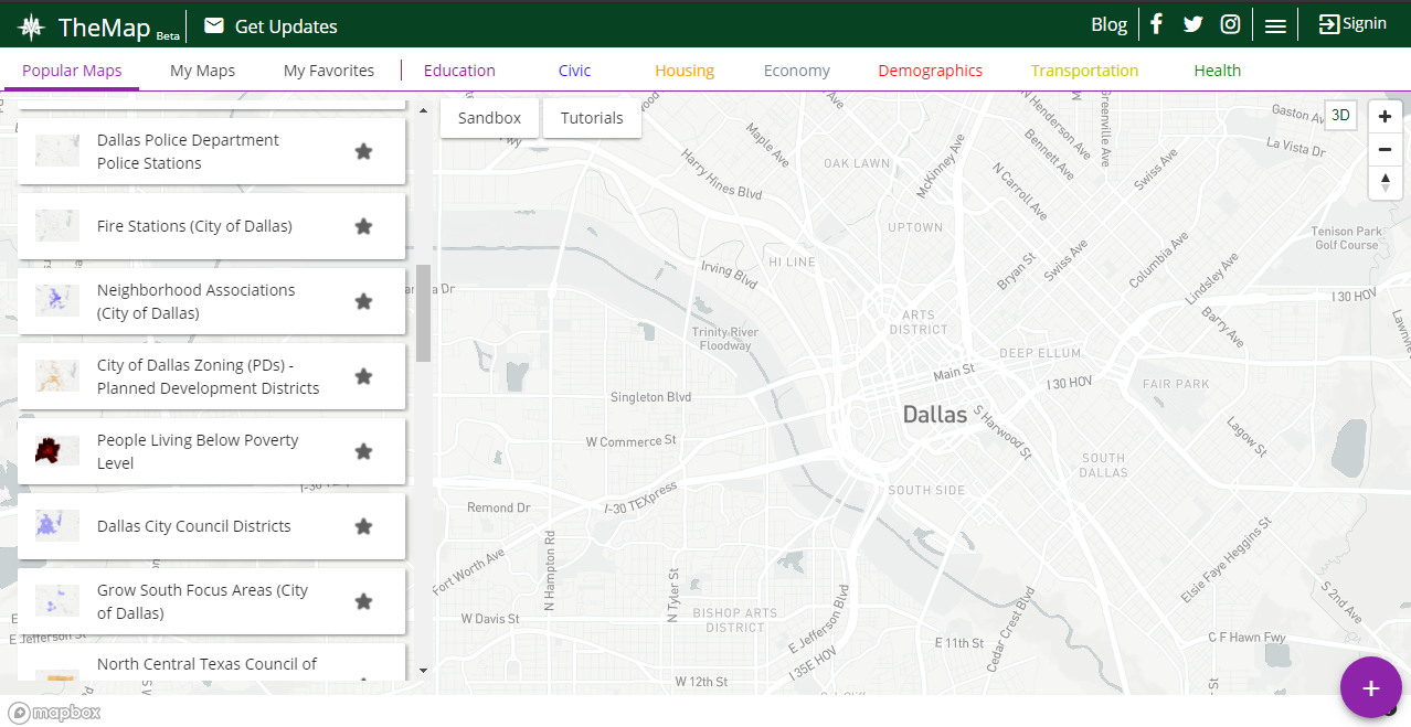
Police stations, fire stations, neighborhood associations, poverty areas—these are some of the data sets that are included in TheMap. Take a look at the column on the left to see them all. TheMap defaults to Popular Maps whe you visit the website.
You can otherwise click on Education, Civic, Housing, or other major types of data sets. Check out the row near the top to see more.
Once you click a data set, the information will be uploaded to the map. Let’s say you click on police departments. Pinpoints of every police department in Dallas will show up on the map. You can click them individually to get the name, address, and more information about the particular police department.
Bus Stops in Dallas
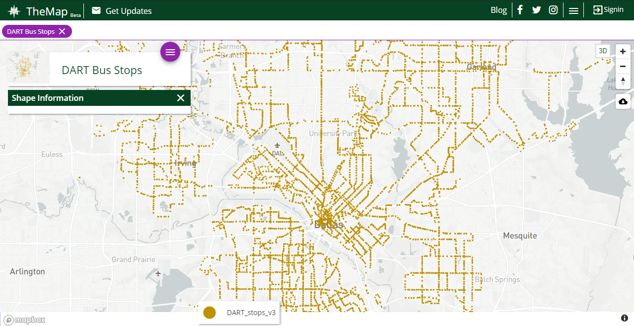
One of my favorite visualizations in TheMap is seeing where DART bus stops are. DART—which stands for Dallas Area Rapid Transit—seemingly has bus stops all over the city. A quick glance shows what can be estimated to over 100 bus stops.
This data set is surely important to Mundinger. After all, he’s concerned with increasing the access of public services to all residents of Dallas, including those below the poverty line. With TheMap, Dallas city officials can combine areas of poverty with bus stop locations. If there’s an area which is lacking of public transportation, DART could add a new bus stop there.
Combining Datasets in TheMap
One of the most powerful and helpful features of TheMap is the ability to combine and layer multiple datasets. To do this, you’ll need to create an account which only takes a minute.
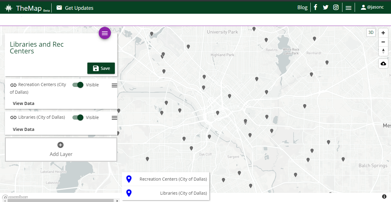
Let’s say I want to see the locations of libraries and recreation centers. People considering a move to Dallas may enjoy both of these placs and want to live near them. See the screenshot of TheMap to see how it looks when you combine data sets.
Notice that recreation centers and libraries are shown on the left side. In the screenshot, they’re both toggled as being “Visible” in TheMap. You can toggle either of them on or off to show their exact locations. Or, you can click on each pin to gain further information.
Final Thoughts on TheMap
Robert Mundinger has done a great, free public service to the city of Dallas. City officials should be using TheMap before they make decisions that will affect the residents of the city. For example, a new police station can be built near an area of high crime.
Dallas isn’t the only city that can benefit from using TheMap. Mundinger, or people inspired by him, can take this idea and apply it to virtually any city. It would all be in the name of improving the lives of residents over an extended period of time.
Featured photo by Aksonsat Uanthoeng on Pexels
TheMap photos are screenshots by RPS Relocation

Oct
The Top 20 Cities to Move to For Startup Founders
Jason C. 0 comments Data Visualization, Moving News
Follow the money! Venture capital investment isn’t equally dispersed; instead, large amounts of it go to a limited number of countries around the world. If you have any interest in working at an emerging firm, you’d do well to move to an area where these firms are plentiful.
Richard Florida of Business Insider reported on the flow of venture capital around the world. Specifically, he created a list of the top twenty metropolitan cities that see the most amount (in dollars) of venture capital. They are:
San Francisco
San Jose
Boston
New York
Los Angeles
San Diego
London
Washington
Beijing
Seattle
Chicago
Toronto
Austin
Shanghai
Mumbai
Paris
Bangalore
Philadelphia
Phoenix
Moscow
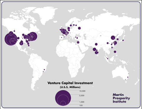
America in the Lead
As you can see from the map, America has the highest concentration of major venture capital investment. Richard Florida writes “the U.S. is the world’s dominant center for venture capital, accounting for nearly 70 percent (68.6 percent) of total global venture capital, followed by Asia and Europe with roughly 14 percent each (14.4 percent for Asia and 13.5 percent for Europe).”
Given our wealth as a nation, it’s not much of a surprise there are so many American cities on the list. Perhaps the most interesting is that there are two cities in India that are on the list: Bangalore and Mumbai.
Looking at the map shows there isn’t much venture capital investment in Latin America, comparatively. That also goes for Canada, Eastern Europe Africa, Southeast Asia, and Australia.
Taking City Size into Consideration
There’s another way to look at the flow of venture capital. Instead of viewing the total invested in a certain area, you can look at investments on a per capita basis. The updated top twenty list is shown below:
San Jose
San Francisco
Boston
Durham
San Diego
Austin
Seattle
Washington
Jacksonville
Los Angeles
New York
Toronto
Salt Lake City
Madison
Greensboro
New Haven
Denver
Oxnard, CA
Providence, RI
Phoenix
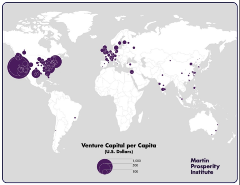
The cities are mixed up and you see some newcomers like Phoenix, Oxnard, and Providence. As a matter of fact, most of the newcomers are more American cities. Most foreign countries have dropped out of this top twenty list entirely. As a matter of fact, only one foreign city remains on this new list: Toronto. And Toronto is close enough in proximity to New York to be considered “foreign” if we think in terms of a place as far as Beijing or Mumbai.
Richard Florida writes “Outside of the U.S., Toronto is the only metro to make the top twenty. London, which ranked 7th on overall venture investment, drops down to 39th. Beijing, which ranked ninth in overall venture investment, now drops to 55th. And Mumbai, ranked 15th overall, drops to 70th when accounting for population. Other notable metros that fall out of the top 20 are Paris (53rd), Bangalore (43rd), and Shanghai (74th).”
Looking at the map, it doesn’t appear much has changed. The “heat map” shows a greater intensity on the American west coast and a smaller intensity on the eastern coast. However, there’s one major similarity between both maps: Venture capital is flourishing in America.
Featured image by rawpixel.com on Pexels
Venture capital map photos are screenshots by RPS Relocation
Aug
How Much Time Residents Of Major USA Cities Waste Commuting In Their Lifetime
Jason C. 0 comments Dallas, Data Visualization, Maps, Seattle
How much time do you spend driving? If you live in or near a major city, the answer is probably “a lot”. EducatedDriver.org has put together a data visualization map which details the average round trip commute time that may affect you.
Alex Lauderdale, the author of the article, writes “We did the math for nearly 1,000 US cities. The average American loses 408 days of their life commuting, and in many areas, the toll is even higher.” Let’s dig a little deeper and look at some individual cities listed.
Here’s How Much Time You’ll Waste Commuting in Your Lifetime (by City)
The Cities We Serve
Here at RPS Relocation, we focus on offering a great relocation experience in Dallas, Seattle, Las Vegas, and Boulder; so we’ll use them as examples. What is the average commute time like in each of these cities? We’ve sorted them from worst to best, starting with Seattle which is the worst on this map.
Seattle, WA — Seattle has one of the worst average round trip commute times in the country. If you look closely at the visualization, the city is marked by a red circle which stands for the longest commutes. Indeed, a commuter in Seattle will spend 463 days of their life on the road. The average round trip commute time is 59.2 minutes.
Dallas, TX — Dallas is orange on the map, which is one step better. A commuter in the city will lose 436 days of their life by driving in or around it. The average round trip commute time in Dallas is 55.8 minutes. Dallas must have just missed being in the red due to its close proximity to the commuting times Seattle drivers have to deal with.
Las Vegas, NV — Las Vegas, like Dallas, is also in the “orange zone”. A commuter in Sin City will spend 381 days of their life on the road. The average round trip commute time in Las Vegas is 48.8 minutes.
Boulder, CO — Out of the four cities, drivers in Boulder have it the best. The city is right in the middle when it comes to average commute times. The area is marked by a yellow circle. A driver in Boulder will lose 350 days of their life to commuting. That’s just under one year! The average round trip commute time in Boulder, CO is 44.8 minutes.
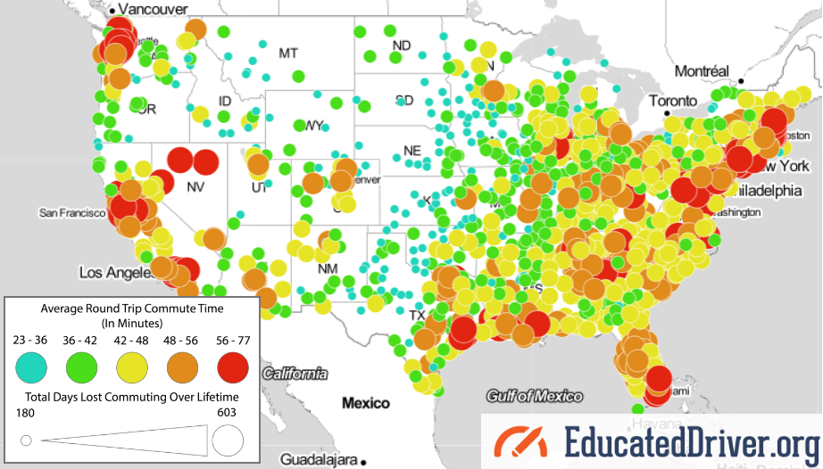
Other Major or Growing Cities
Major cities in red on the visualization map seem to be the largest in the country. Many of the ones in yellow seem to be growing or up-and-coming cities. Austin, Charlotte, and Denver come to mind. For the remainder, take a glance at where these cities stand with regards to the average round trip commute time. The number after each city is the round trip time in minutes.
Red Circle
New York 71.8
Washington D.C. 68.8
Chicago 64.4
San Francisco 64.2
Boston 64
Philadelphia 63
Miami 61.2
Los Angeles 60.8
Houston 59
Orange Circle
San Jose 54.6
Denver 54.6
Nashville 54
Detroit 53.4
Austin 52.8
Jacksonville 52.6
Charlotte 52.6
Portland 52.4
Phoenix 52
San Antonio 51.4
San Diego 50.6
Yellow Circle
Kansas City 45.8
Oklahoma City 44.8
Featured photo by Pixabay on Pexels
EducatedDriver.org data visualization map photo is a screenshot by RPS Relocation

Aug
Homelessness is an ongoing problem for many people and communities. Mental illness, poverty, domestic abuse, laziness—these are some common reasons people become homeless. Statista recently created the chart below which details the cities that have the highest number of homeless people.
 You will find more infographics at Statista
Interpreting the Numbers
A quick glance at the chart shows a shocking number of homeless people. Half a million people would fill ten major sports arenas! Digging a little deeper, however, shows that the number is comparatively small compared to how many people there are in the United States. The United States Census Bureau states that the population is just over 328 million. That means only 0.17% of people here are homeless. While the percentage is small, it’s still about 0.17% too much.
The Census Bureau also lists the most populous states. Four of them, in order, are California, Texas, Florida, and New York. How does this match up with our chart? Four of the ten are cities in California. New York, while only having one city in the chart (New York City), is by far the winner (or loser) when it comes to the highest number of homeless people that live in any particular state.
Percentages Against Total Number of Homeless
Statista lists the ten cities with the highest number of homeless. Adding those numbers will net 192,535 homeless people, which is nearly 35% of the total homeless in the United States. This makes sense since we learned earlier that California and New York, a couple of the most populous states, have cities with a high number of homeless people.
Let’s take a look at how the ten cities compare again the total number of homeless.
Total Number of Homeless: 553,742.
- Philadelphia: 1%
- Boston: 1.1%
- Las Vegas/Clark County: 1.2%
- San Francisco: 1.2%
- San Jose/Santa Clara City & County: 1.3%
- District of Columbia: 1.3%
- San Diego City and County: 1.7%
- Seattle/King County: 2.1%
- Los Angeles City & County: 10%
- New York City: 13.8%
What’s striking here is that most of the cities seem to have similar percentages. Statistically, Los Angeles and New York City see large jumps and can be considered the outliers of the sample. However, we need to take into consideration that those two cities are massively larger than the others in terms of size and population.
Percentages Against Total Number of Homeless Within Top Ten
Another way of looking at the data is to compare the numbers within each other. For this we won’t take into consideration the total number of homeless; however, we’ll use 192,535. As we learned earlier, that is the sum of the number of homeless from each of these ten cities. Here’s what we get:
- Philadelphia: 3%
- Boston: 3.2%
- Las Vegas/Clark County: 3.4%
- San Francisco: 3.6%
- San Jose/Santa Clara City & County: 3.8%
- District of Columbia: 3.9%
- San Diego City and County: 4.8%
- Seattle/King County: 6%
- Los Angeles City & County: 28.7%
- New York City: 39.7%
While Los Angles and New York City are still the outliers, this gives us a somewhat clearer picture of the data. The two large cities command roughly 68.4% of the total homeless within the top ten cities.

Featured photo by Pixabay and sleeping homeless man photo by Alvin Decena on Pexels

Jul
What time zone do you live in? Depending on where you’re planning moving, you might end up in a different time zone. Moving to a neigboring time zone shouldn’t be too difficult; however, moving to a farther time zone may require some adjustment, especially when it comes to your sleep schedule.
A Reddit user, u/ptgorman, recently shared the time zone visualization shown above. It details the time zone of American cities with a popular of over 100,000 people. The data was pulled from Wikipedia’s List of United States cities by population. Reddit users have commented on the thread. Let’s take a look at what they wrote.
Common and Outlying Zones
Pacific, Central, and Eastern times are the most popular time zones. The number of cities in each is similar to each other. The cities in Mountain time are numbered less than half of the most common zones. Hawaii, Alaska, and Atlantic time zones can be considered the outliers of the data. Each of those three has five or fewer cities with a population of over 100,000 people.
Texas and Time Zones
As Reddit user, u/sertorius42 says, Texas has many cities with a population over 100,000 people. They counted 14 in the Dallas-Fort Worth area; however, another Reddit user, u/Bonesaw823, quickly corrected u/sertorius42, advising the Dallas-Fort Worth area actually has 15 cities with a population of over 100,00 people.
Texas has two time zones: Central and Mountain Time. Most of the state is in the Central Time Zone. Only two counties—Hudspeth and El Paso—are in the Mountain Time Zone. These two are the western Texas counties.

Total Population of Time Zones
If you look at each time zone’s total population, the visualization would look very different. For example, the number of cities in Pacific, Central, and Eastern Time Zones with a population of over 100,000 people are similar; however, most of the general population lives in the Eastern Time Zone. It will probably stay like that for a long time.
U/ptgorman also shared relevant information about where the total population lives. In terms of total population, the Eastern Time Zone has 47.6%, the Central Time Zone has 29.1%, the Mountain Time Zone has 6.7%, and the Pacific Time Zone has 16.6%. This data comes from the 2015 Census estimates (via MetricMaps). So, if the visualization showed time zones by percentage of the population, Eastern Time Zone would show more than the others.
Given this information, another Reddit user, u/TradinPieces, expressed surprise that more Eastern Time Zone cities weren’t on the list. This makes sense for a couple reasons. One is that the population was able to grow on the eastern part of the country over the past few hundred years. The eastern part is where most of the historical immigration originated. Another is that, if a great part of the population resides on the eastern side, one would imagine there would be a high number of cities where the population is over 100,000 people. This just goes to show that data visualizations can be surprising and are a great and fun way to learn.

Featured Image by Kaique Rocha on Pexels
Most Recent Blog Posts
 A Dallas Area Home Buyer Had to Pay $300,000 More Than Asking Price For Their New Home22 May, 2021
- Canada's Home Prices Have Risen 168.4% Since 2000, USA Home Prices Have Risen 54.99%01 Apr, 2021
- Home Prices in Seattle Are Skyrocketing12 Mar, 2021
- Seattle Among Best Cities for Startups08 Jul, 2019
- Renters in Chicago and New York are fleeing south for Dallas24 Jun, 2019