Blog

Sep
What does a nation do if it has too much food? The phrase “too much food” is a bit of a misnomer. After all, too much food is actually a good thing. World hunger is alive and well. In addition, people go hungry right here in the United States due to reasons associated with poverty. This shouldn’t happen because there is an excess of food on a daily basis.
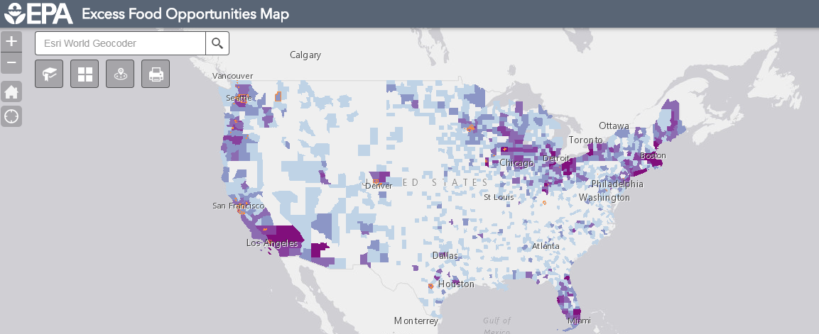
Think about restaurants that don’t sell all of their food by the end of the day. Where does that food go? Often times, it’s simply thrown out with the garbage. Other times, it’s donated. The Environmental Protection Agency has mapped out where opportunities exist to save excess food.
About the Food Opportunities Map
“The U.S. EPA Excess Food Opportunities Map supports nationwide diversion of excess food from landfills. The interactive map identifies and displays facility-specific information about potential generators and recipients of excess food in the industrial, commercial and institutional sectors and also provides estimates of excess food by generator type.”
Food banks, correctional facilities, educational institutions, composting facilities—these are some of the establishments you’ll find by exploring the interactive map. A quick glance of it shows a “heat map” of where these establishments are. There are ample establishments up and down the West Coast. On the other side of the country, Florida seems to have a good amount. Elsewhere, the Upper Midwest and stretching to the Upper East Coast show numerous establishments.
Food Opportunities in Dallas
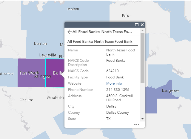
According to the EPA’s map, there are currently nine excess food opportunities in Dallas. The photo below shows the institutions are sorted by anaerobic digestion facilities, composting facilities, and food banks. Dallas has 4 anaerobic digestion facilities, 3 composting facilities, and 2 food banks. You’ll see a similar list any time you click another area on the map.
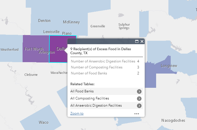
Clicking through the facility type will show you the actual facility or food bank. For example, the North Texas Food Bank is one of them. It shows the address and phone number of each facility. The amount of food received per year is even listed. The North Texas Food Bank received 26,453.44 tons of food. That can feed a lot of people!
Goals of the Food Opportunities Map
The EPA created the map in part to let establishments know where to find these facilities. The EPA wants less food to be wasted and more excess food to be donated. They say that the “map will help you learn about potential sources of excess food in your region and potential non-landfill recipients, such as composting and anaerobic digestion facilities.”
The EPA also wants to highlight the “potential infrastructure gaps for managing excess food”. Managing excess food requires logistics to get the food to a facility where it can be donated. At a larger level, the EPA perhaps wants to highlight where a facility isn’t. If there is an area with a high amount of excess food, there should be a facility such as a food bank. That way, we can put more excess food to better use.
Featured photo by Daria Shevtsova on Pexels
EPA food opportunities map photos are screenshots by RPS Relocation
Aug
How Much Time Residents Of Major USA Cities Waste Commuting In Their Lifetime
Jason C. 0 comments Dallas, Data Visualization, Maps, Seattle
How much time do you spend driving? If you live in or near a major city, the answer is probably “a lot”. EducatedDriver.org has put together a data visualization map which details the average round trip commute time that may affect you.
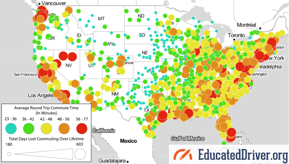
Alex Lauderdale, the author of the article, writes “We did the math for nearly 1,000 US cities. The average American loses 408 days of their life commuting, and in many areas, the toll is even higher.” Let’s dig a little deeper and look at some individual cities listed.
Here’s How Much Time You’ll Waste Commuting in Your Lifetime (by City)
The Cities We Serve
Here at RPS Relocation, we focus on offering a great relocation experience in Dallas, Seattle, Las Vegas, and Boulder; so we’ll use them as examples. What is the average commute time like in each of these cities? We’ve sorted them from worst to best, starting with Seattle which is the worst on this map.
Seattle, WA — Seattle has one of the worst average round trip commute times in the country. If you look closely at the visualization, the city is marked by a red circle which stands for the longest commutes. Indeed, a commuter in Seattle will spend 463 days of their life on the road. The average round trip commute time is 59.2 minutes.
Dallas, TX — Dallas is orange on the map, which is one step better. A commuter in the city will lose 436 days of their life by driving in or around it. The average round trip commute time in Dallas is 55.8 minutes. Dallas must have just missed being in the red due to its close proximity to the commuting times Seattle drivers have to deal with.
Las Vegas, NV — Las Vegas, like Dallas, is also in the “orange zone”. A commuter in Sin City will spend 381 days of their life on the road. The average round trip commute time in Las Vegas is 48.8 minutes.
Boulder, CO — Out of the four cities, drivers in Boulder have it the best. The city is right in the middle when it comes to average commute times. The area is marked by a yellow circle. A driver in Boulder will lose 350 days of their life to commuting. That’s just under one year! The average round trip commute time in Boulder, CO is 44.8 minutes.
Other Major or Growing Cities
Major cities in red on the visualization map seem to be the largest in the country. Many of the ones in yellow seem to be growing or up-and-coming cities. Austin, Charlotte, and Denver come to mind. For the remainder, take a glance at where these cities stand with regards to the average round trip commute time. The number after each city is the round trip time in minutes.
Red Circle
New York 71.8
Washington D.C. 68.8
Chicago 64.4
San Francisco 64.2
Boston 64
Philadelphia 63
Miami 61.2
Los Angeles 60.8
Houston 59
Orange Circle
San Jose 54.6
Denver 54.6
Nashville 54
Detroit 53.4
Austin 52.8
Jacksonville 52.6
Charlotte 52.6
Portland 52.4
Phoenix 52
San Antonio 51.4
San Diego 50.6
Yellow Circle
Kansas City 45.8
Oklahoma City 44.8
Featured photo by Pixabay on Pexels
EducatedDriver.org data visualization map photo is a screenshot by RPS Relocation
Aug
How does a neighborhood get its name? Often times, the political establishment will christen it. Other times, the residents of the area will name it. More recently, new names for neighborhoods have popped up on Google Maps. The New York Times recently dug a little deeper to find out why.
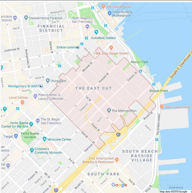
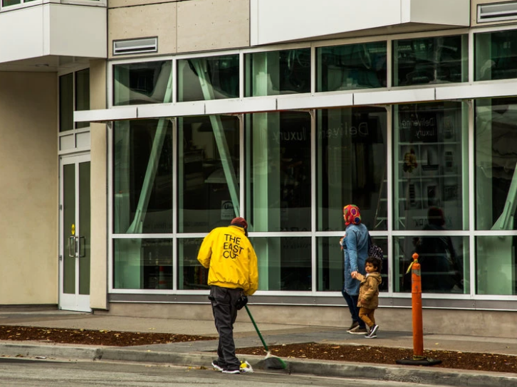
The East Cut
Imagine this: you live in the same neighborhood your whole life. Let’s say it’s called Old Town. Then, an acquaintance tells you to meet them down the street at an establishment in the “East Cut” neighborhood. You’ll have to ask for clarification because surely there’s no such place. The acquaintance pulls up Google Maps on their smartphone and proves it to you.
It may seem like the Twilight Zone to some; however, that’s exactly what happened earlier this spring. The New York Times writes “For decades, the district south of downtown and alongside San Francisco Bay here was known as either Rincon Hill, South Beach or South of Market. This spring, it was suddenly rebranded on Google Maps to a name few had heard: the East Cut.”
Typos and Mistakes
One would assume a platform like Google Maps would have precise spelling; however, that isn’t the case if the name submitted was misspelled in the first place. Arthur Mullen, a former city planner in Detroit, created a map as a side project back in 2002. His map, which was eventually posted online by locals, contained typos.
Timothy Boscarino, another city planner in Detroit, advised that Google Maps has incorporated Arthur Mullen’s map. “Google almost identically copied that map’s neighborhoods and boundaries, he said — down to its typos. One result was that Google transposed the k and h for the district known as Fiskhorn, making it Fishkorn.”
Here’s the problem with typos and mistakes: they spread from Google Maps to other online platforms. With regards to the East Cut, the “peculiar moniker immediately spread digitally, from hotel sites to dating apps to Uber, which all use Google’s map data. The name soon spilled over into the physical world, too. Real-estate listings beckoned prospective tenants to the East Cut. And news organizations referred to the vicinity by that term.”
How the Naming is Established
Google isn’t always clear with how they name or rename neighborhoods; however, we can presume that they do so with information already found online. This seemed to be the case after Arthur Mullen’s map appeared online.
The New York Times writes “The company declined to detail how some place names came about, though some appear to have resulted from mistakes by researchers, rebrandings by real estate agents — or just outright fiction.” The story of Jeffrey Schneider all but confirms this.
Jeffrey Schneider, an architect based in Los Angeles, owned a rental apartment. He wanted a new tenant so he ran some ads to make the available unit known. He decided, partly as a joke, to name his neighborhood “Silver Lake Heights”. In reality, the area he lived in was called only Silver Lake. Google Maps got a hold of the name ” Silver Lake Heights” and it began appearing on the platform.
Featured photo by Pixabay on Pexels
The East Cut map and photo are screenshots by RPS Relocation

Jul
Not all killers get caught. In a chilling reminder that some haneous crimes go unpunished The Washington Post recently conducted an in-depth study about areas where murders go unsolved. Their findings were surprising. They “mapped more than 52,000 homicides in major American cities over the past decade and found that across the country, there are areas where murder is common but arrests are rare”. Why? Let’s take a look at a few cities from the study.
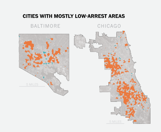
The study found that Chicago and Baltimore are the two cities with the most areas with high volumes of unsolved murders.
Indianapolis
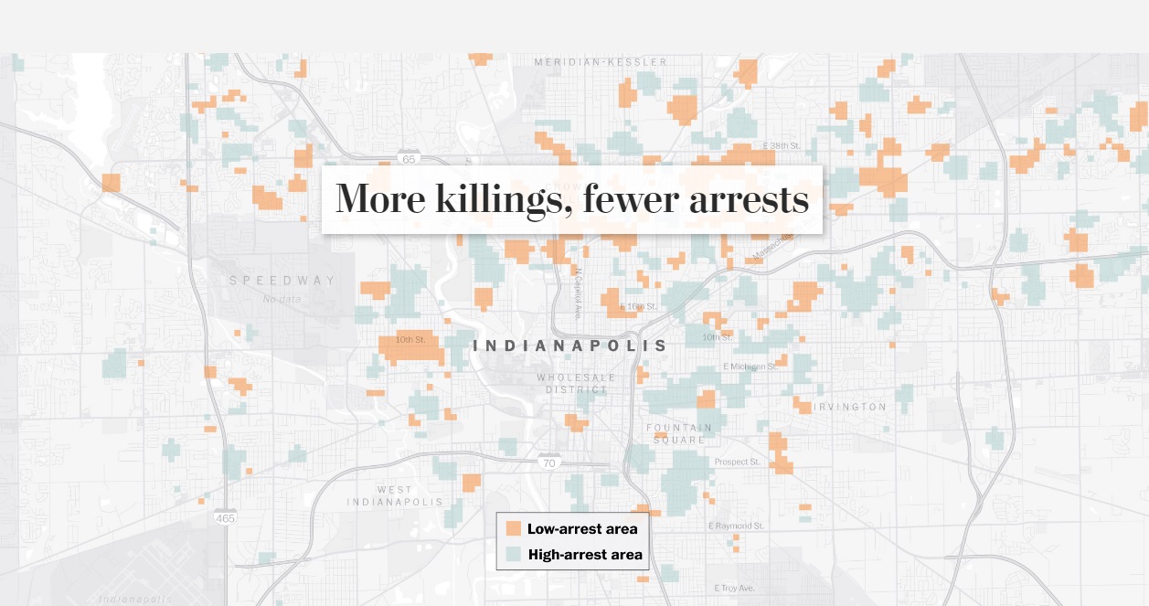
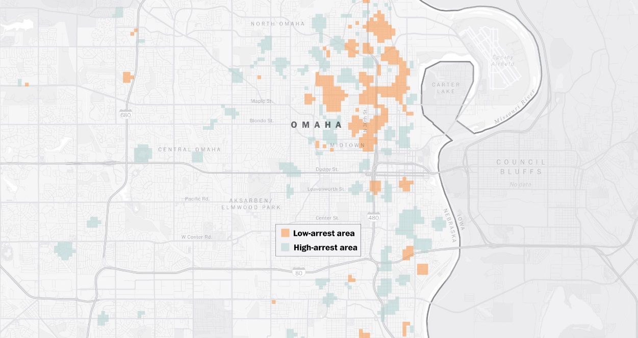
There are some cities around the country that have a higher number of unsolved murders. Indianapolis — a place with a high murder count and a low arrest count — is one of these cities. In Indianapolis, “only 64 of the 155 criminal homicides last year resulted in an arrest”.
What’s more interesting, and which you can see from the photo below, is that Indianapolis has scattered areas of low arrests versus high arrests. Arrests for murder in the city aren’t contained to one or even a few general areas. They happen all throughout the city.
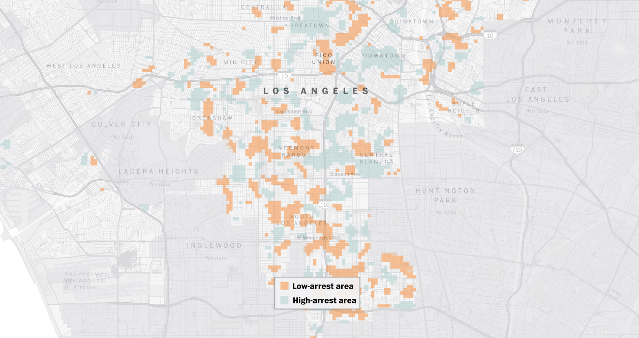
Los Angeles
Other cities around the country have seen a decrease in the number of killings. “In sprawling Los Angeles, police are proud of their homicide statistics over the past decade. The number of killings has dropped annually, and more than half of the 2,200 homicides since 2010 have led to an arrest, which is slightly better than average for cities surveyed.”
According to L.A. Police Captain Billy Hayes, “there are so many gangs in the city”. Gangs are normally associated with drugs, murder, and a host of other serious crimes. Therefore, having the police target gangs would likely lead to a decrease in the crime rate.
Omaha
Omaha, Nebraska. For many people, farmland and good old-fashioned American living is the first thing that comes to mind. We don’t associate the Heartland of America with gang murders. Even more shocking is what a former Omaha police chief said about crime in and around the city. Thomas Warren said “in many cases, these are not innocent victims. Unfortunately, you’re not going to get a lot of cooperation if the victims themselves were involved in gang activity or drug distribution.”
Challenges and Solutions
Police face numerous challenges when pursuing an arrest of a suspected murder. One challenge is that they need to have a lead. If the police don’t have a good relationship with the community, it will be difficult for them to gain information from their local public.
“Police blame the failure to solve homicides in these places on insufficient resources and poor relationships with residents, especially in areas that grapple with drug and gang activity where potential witnesses fear retaliation.” This makes perfect sense since many murders are gang-related. Very few people want to talk with the police out of fear they’ll be targeted by the gang. Detectives, however, say that community engagement is the key to solving and preventing murders and other criminal acts.
Featured Photo by Kat Wilcox on Pexels

Jun
Map Using Google Search Data Reveals The Most Popular Exercise Activity in Each State
Jason C. 0 comments Maps
There are numerous benefits to exercising. Energy levels, weight loss, skin health—each of these are improved by exercising. In addition, exercise is said to increase brain health, improve mood, and reduce the risk of chronic diseases. One has to wonder why more people don’t work out. There are reasons for that too, such as limited time or a lack of motivation. Some people also go through phases, working out for a period of time and then going on an a hiatus from exercise.
When someone wants to exercise they can choose from a large number of activities. Some of these activities include jogging, swimming, yoga, and hiking. Fitness Equipment Source recently put together a list of the most popular exercises in each state. The website used Google AdWords Keyword Planner Tool to collect the data. They also listed the 14 most popular exercises by keyword search volume on Google. They are:
1. Yoga
2. Running
3. Hiking
4. CrossFit
5. Swimming
6. Kayaking
7. Gymnastics
8. Cardio
9. Bodybuilding
10. Weightlifting
11. Aerobics
12. Mixed Martial Arts (MMA)
13. Martial Arts
14. Jogging
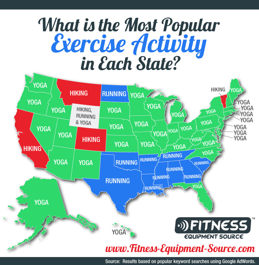
Hiking, Running, and Yoga
As you can see from the picture, and the list, hiking, running, and yoga are the most popular exercise activities. They are also the most popular activities in each state. Strangely enough, one can see a type of pattern with the geographical locations of yoga states versus running states. Yoga seems to be more popular in the middle and northern states while running seems to be more popular in the southern states.
North Dakota is the only northern state where running is the most popular exercise search keyword. On the other hand, Florida is the only southern state where yoga is the most popular exercise search keyword. Interestingly enough, yoga is the most popular exercise search term in Alaska and Hawaii. There are only four states which have a majority of “hiking” as the exercise keyword: California, Colorado, Montana, and Vermont.
Residents of Wyoming either can’t decide which exercise they love most or enjoy exercising so much they listed all three top exercises, as seen in the photo.
Top Exercise Activities by Volume
Each of the activities listed has a “most popular state” for it. That doesn’t mean it’s the most popular activity in that state overall. Even though hiking is the most popular search term in California, the state also has the highest search numbers for “running”. This is probably because there are so many people in California. Let’s talk about some other exercise activities on the Top 14 list.
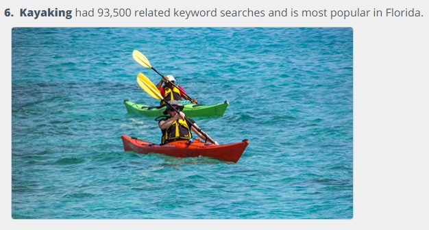
“Swimming had had 117,390 related keyword searches with the highest per capita rate in the state of New Jersey. Kayaking had 93,500 related keyword searches and is most popular in Florida. Gymnastics reigns supreme in Texas with 64,430 related keyword searches.”
It’s not surprising that kayaking is most popular in Florida. After all, most of the state is surrounded by water and it has numerous rivers running through it.
Featured Photo by Chevanon Photography on Pexels
Jun
Worst USA Airports
Jason C. 0 comments Maps
Worst and best US airports by the numbers [OC] from dataisbeautiful
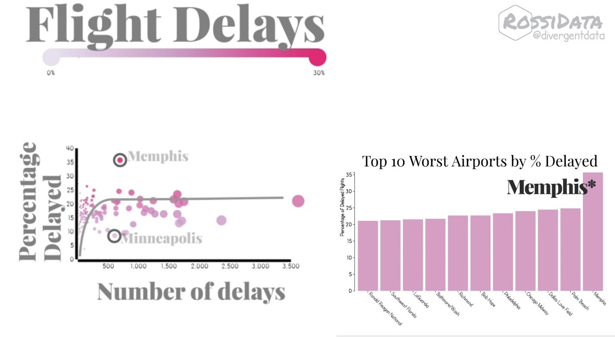
When you pay for a service you expect a seamless experience. That isn’t always how it is when it comes to flying on an airplane. Flight delays are a recurring theme at many large-scale airports around the country. Let’s take a closer look at the worst USA airports, ranked by delays.
A Reddit user, u/divergentdata, recently put together a video detailing the worst airports for delays. This information was shared on Reddit and many other Reddit users commented in the thread.
Total Versus Percentage
It’s important to understand the difference between total delays in an airport and total delays by the number of flights that transit an airport. Reddit user u/uddermann summed it up nicely. The total delays in order are “1. Ohare 2. Hartfield Atlanta 3. San Francisco 4. Dallas 5. Los Angeles 6. Newark Liberty 7. Philadelphia 8. Charlotte Douglas 9. LA Guardia 10. JFK”.
U/uddermann also chimed in on the top ten delays by transit percentage. They are “1. Memphis 2. Palm Beach 3. Dallas Love Field 4. Chicago Midway 5. Philadelphia 6. Bob Hope 7. Richmond 8. Baltimore/Washington 9. LA Guardia 10. Southwest Florida 11. Ronald Regan”. What this means is that, even though airports such as Memphis or Palm Beach aren’t large, they still have a large amount of delays flights, percentage-wise.
Airport Stories
Many Reddit users expressed frustration about traveling through some of the airports shown above. U/yeerk_slayer says “Chicago Suburbian here. I can confirm that almost all of my flights leaving O’Hare are delayed for one reason or another. But then again, we do have some pretty sporadic weather.” I have flown to and from Chicago in the past and can personally confirm that there are plenty of delays at O’Hare and Midway.
Minneapolis didn’t make the list. U/JMoc1 might be able to shed some light on that. He says “Minneapolis has the best clearing crews in the US. In fact, MSP is actually the training ground for all clearing crews and plowing services in the US”. U/JMoc1 is referring to clearing crews cleaning snow at the airport. Minneapolis is up north and gets quite a bit of snow.

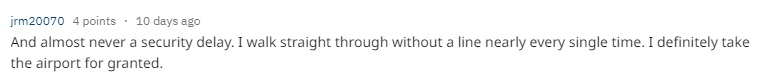
Looking on the Bright Side
Although the main focus of the tread is airport delays, some Reddit users tried to see airports in a more positive light. For example, Reddit user u/Valiuncy said “if there’s one thing I like about Indianapolis, it’s our perfect airport. It’s so easy, clean, never too crowded, looks nice, and is everything an airport should be”. U/jrm20070 replied saying there’s “almost never a security delay [in Indianapolis]. I walk straight through without a line nearly every single time. I definitely take the airport for granted”.
Rumors on Causes for Delay
Constant delays in some airports have created some rumors in commentators. For example, u/raxitron said: “I think Memphis is the highest % delayed because it’s a hub for FedEx and their planes get priority over the small number of passenger flights”. Comments like these are only hearsay; however, one has to wonder if there is a link between commercial flights causing passenger flights to be delayed.

Featured Photo by Harry Knight on Unsplash

Jun
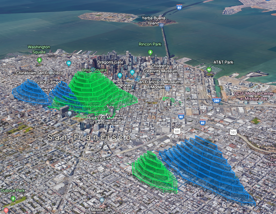
SF Police open data in Google Earth (Drugs=GREEN, Prostitution=BLUE) [OC] from dataisbeautiful
Crime is a perpetual plague on society. It always has been and it always will be. In our modern times, we continue to look for ways to minimize crime. One of the ways law enforcement does this is by focusing on trouble areas. The San Francisco Police Department wanted to know where these trouble areas are. So they collect and report data to pinpoint troubled areas.
A user on Reddit, u/SquishyData, recently put together the visualization of this crime data that you see above. He specifically focuses on where a majority of drug and prostitution arrests or incidents happen in and around San Francisco. A picture says a thousand words, and u/SquishyData wanted to see what people would say about the visualization Many Reddit users have commented, providing additional information. Let’s read what they said.
Not the Whole Picture
Data requires interpretation. For example, and as u/SteamandDream alludes to below, the data only shows locations where arrests or incidents happen. I’m sure there are dangerous neighborhoods where even the police don’t like to patrol. The crime occurrences in those areas will not show up in the data visualization picture.

Real Experiences
People who are from or have visited San Francisco can correlate their experiences with the data picture. This picture also gives tourists a great idea of what places to avoid. For example, u/normal_whiteman stated: “I’m visiting SF soon and this map is a great resource”. Hopefully, other visitors to San Francisco will also see the visualization since it would give the visitors a better chance to stay safe.
![]()
Another View
Data being open to interpretation allows for differing opinions. For example, u/pantless_pirate has replied against another comment stating that the lit up areas are where one is less likely to get arrested for drugs or prostitution. U/pantless_pirate replied “You would think, but it’s actually the opposite. The lit up areas are the areas where you are safest to partake in drugs or prostitution because those areas are the least gentrified and while the cops monitor those activities in those areas, they don’t actually ever make any arrests. If you tried to smoke crack openly near AT&T stadium you’d be picked up in a second. In the heart of the Tenderloin, the cop standing on the other corner would be making sure you stay out of traffic but otherwise let you alone.”
A Separation of Crime
Other users, like u/puppy2010, made an interesting observation which indicates drug and prostitution occurrences happen in separate areas. There’s a clear overlap in the area at the top; however, the visualization shows drug and prostitution arrests happen in different areas, even though they are mostly next to each other. U/SquishyData, the creator of the visualization, commented “I was also surprised! It’s important to also note that the records are incident reports and not all reports lead to an arrest. Maybe the police are keeping tabs on these areas and not arresting.”

Mar
Where Vancouver’s Empty Homes Are
Joe Youngblood 0 comments Maps
The city of Vancouver in British Columbia, Canada just announced a new empty homes tax which is projected to impact about 5% of the homes in the city. This move comes as the city fights high housing prices along with other measures like increasing the Foreign Buyer tax from 15% to 20% in hopes of keeping non-Canadian real estate investors out of the city.
61% of the empty houses in Vancouver are Condos with another 6% belonging to other types of multi-family housing such as townhomes, apartments, and duplexes. Almost 25% of all empty homes are located in Downtown Vancouver making up the largest volume of empty homes with the West End neighborhood coming in second place. In percentage of empty homes per neighborhood West End and Shaugnessy are both tied for the top spot with 8% of homes in both neighborhoods reported as empty.
This map of Vancouver neighborhoods breaks down where the empty houses in Vancouver are located.

If you’re looking to move to Canada from Seattle or Dallas or relocating from anywhere, or just want to invest in the Canadian real estate market, this map will be useful in understanding Vancouver’s new housing laws and housing markets.
Featured Photo by Gabriel Santiago on Unsplash

Mar
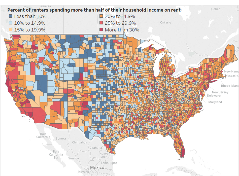
Where in the USA Renters Spend More Than Half of their Income On Rent
Joe Youngblood 0 comments Maps, Moving News
If you’re one of the estimated 40 million Americans moving this year, there’s a good chance you might end up renting a new apartment, condo, townhome, duplex, or house. One issue that’s been getting more attention lately is how much of their income renters are spending on rent instead of saving or spending on other things. The more that is spent on rent, which doesn’t help consumer’s credit scores, the less that is able to be placed into long-term savings, paid on education loans, invested in markets, or spent on consumer items.
Based on a new map you may want to consider moving into a lower populated area if possible. The map was made by Reddit user /u/academiaadvice and shows counties in the USA color-coded by where residents spend x% of their income on rent. The red and dark red areas indicate where a population spends over 25% of their income on housing rent, something most financial experts advise not to do. These counties almost perfectly line up with population density maps showing the more congested an area is, the more likely a renter is to pay a larger percentage of their monthly income in rent.
Out of all of the states California appears to be the worst for renters along with New York, Washington, Oregon, Arizona, and Florida. Some of the more affordable states include Texas, Oklahoma, Kansas, Nebraska, Utah, Montana, and Missouri.
Most Recent Blog Posts
 A Dallas Area Home Buyer Had to Pay $300,000 More Than Asking Price For Their New Home22 May, 2021
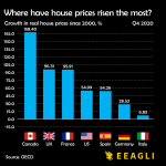
- Canada's Home Prices Have Risen 168.4% Since 2000, USA Home Prices Have Risen 54.99%01 Apr, 2021
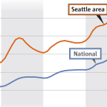
- Home Prices in Seattle Are Skyrocketing12 Mar, 2021
- Seattle Among Best Cities for Startups08 Jul, 2019
- Renters in Chicago and New York are fleeing south for Dallas24 Jun, 2019