Blog

Apr
Does it matter where you grow up? More specifically, are the same economic opportunities available to all Americans, no matter where they were raised? There’s new evidence that’s able to answer these questions. The Opportunity Atlas essentially puts the roots of poverty on the map.
As an introduction, they state, “The Opportunity Atlas answers this question using anonymous data following 20 million Americans from childhood to their mid-30s. Now you can trace the roots of today’s affluence and poverty back to the neighborhoods where people grew up. See where and for whom opportunity has been missing, and develop local solutions to help more children rise out of poverty.”
They then prompt you to explore cities around the U.S. In this article, we’re going to take a closer look at 5 major cities: Seattle, Dallas, Houston, Austin, and Chicago. Let’s get started!
Seattle
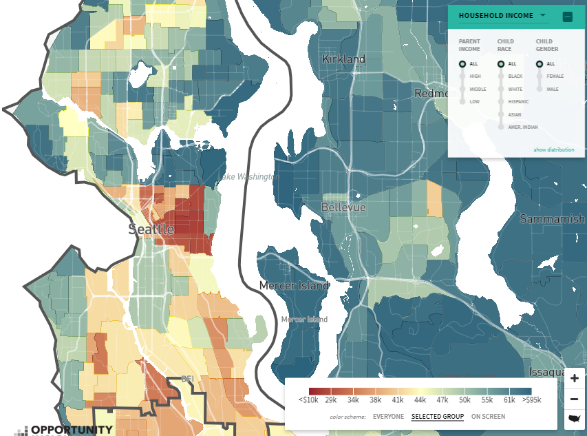
Take a look at the map above. The main colors here are red, white, blue and shades in between. The colors indicate household income over the course of one year. The redder the color, the less money the family makes. The bluer the color, the more the family makes. And, white is essentially the median income in the area. This goes for all maps you’ll look at in this article.
A quick glance at the map shows that the worse parts, income-wise, is right in the heart of Seattle. This doesn’t make that there are no high-paying jobs there. Instead, as mentioned before, it’s the median income for all families living within a certain area.
Dallas
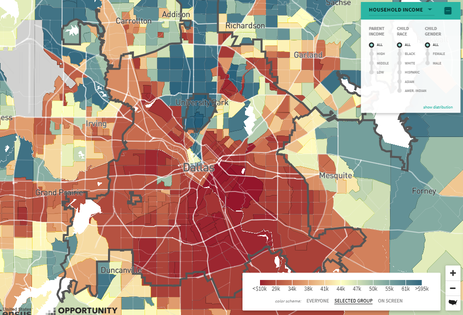
There’s quite a bit more red in Dallas than there is in Seattle! The good thing, however, is that the cost of living is generally lower in Dallas than it is in Seattle. Venture out to University Park and Forney, among other cities, and you’ll realize areas of higher family median income.
Houston
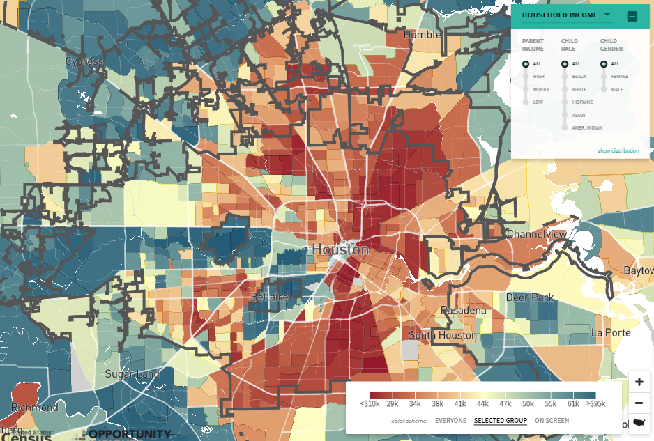
The colors of Houston look very much like those of Dallas. I’d venture to say, however, that it appears Houston has more blue areas. The inner city to the north and south are quite red. West of the city looks very blue, especially around Sugarland and Bellaire. To the west, cities like Deer Park have a higher household income.
Austin
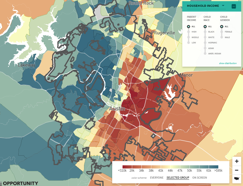
Austin, like you’ll see next with Chicago, looks like night and day when it comes to areas around the city. To the west, it’s mostly blue. To the east, it’s mostly red. Think about the kids growing up to the west and to the east. Do they stay in those areas when they grow up, and make the same or a similar amount of money as their parents did?
Chicago
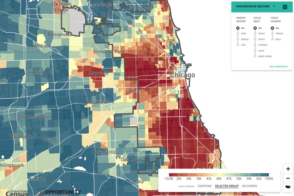
Chicago, to the immediate west and south, is very red. Maywood is also red. Speaking of Maywood, the area has a very high crime rate. You might be wondering why the east side of Chicago is all white. It’s not because the area is full of average or median income households. Instead, that’s where Lake Michigan is!
Featured photo by Useche70 on Pixabay
Map photos are screenshots by RPS Relocation
Comments
Most Recent Blog Posts
 A Dallas Area Home Buyer Had to Pay $300,000 More Than Asking Price For Their New Home22 May, 2021
- Canada's Home Prices Have Risen 168.4% Since 2000, USA Home Prices Have Risen 54.99%01 Apr, 2021
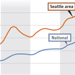
- Home Prices in Seattle Are Skyrocketing12 Mar, 2021
- Seattle Among Best Cities for Startups08 Jul, 2019
- Renters in Chicago and New York are fleeing south for Dallas24 Jun, 2019