Blog

Dec
Best U.S. Cities for New Year’s Eve Celebrations
Joe Youngblood 0 comments Dallas, Maps, Seattle
Get ready for 2019! In celebration of the new year, we decided to write about the best cities for New Year’s Eve celebrations. WalletHub compiled multiple data points in numeous cities to determine which ones made the cut.
Methodology of Choosing Cities
Adam McCann of WalletHub writes they used “three key dimensions: 1) Entertainment & Food, 2) Costs and 3) Safety & Accessibility. We evaluated those dimensions using 28 relevant metrics. Each metric was graded on a 100-point scale, with a score of 100 representing the most favorable conditions for New Year’s Eve partiers.”
Among the 28 metrics, some are:
- New Year’s Eve Events per Capita
- Duration of 2018 Fireworks Show
- Availability of Affordable Fine Dining
- Average Alcoholic Beverage Price
- Traffic Congestion
- Neighborhood Security
The 100 Best Cities
Using the 28 metrics, WalletHub was able to rank the top 100 cities. Let’s talk about the top five in order. They are: New York, Los Angeles, Atlanta, San Diego, and Las Vegas.
New York has the world-famous Times Square celebrations; however, the celebrations of the other top cities are lesser known. Near Los Angeles, the EVE party at Universal Studios Hollywood is popular. In Atlanta, the popular Peach Drop emulates the ball drop in Times Square. Big Night San Diego is a popular New Year’s Eve party event. And in Las Vegas, 40,000 people watch multiple simultaneous fireworks shows from the downtown area.
Numerous cities in Texas, and Seattle, also ranked highly on the list. In Texas, some of the best cities are: San Antonio (#16), Dallas (#17), Houston (#22), Austin (#27), El Paso (#35), and Fort Worth (#46). Seattle clocks in fairly high at #15.
See the full list of the best U.S. cities for New Year’s Eve celebrations below. Have you attended a New Year’s Eve celebration in one of the cities below? We’d love to hear about your experience.
- New York, NY
- Los Angeles, CA
- Atlanta, GA
- San Diego, CA
- Las Vegas, NV
- Denver, CO
- Orlando, FL
- Chicago, IL
- Washington, DC
- San Francisco, CA
- Miami, FL
- New Orleans, LA
- Philadelphia, PA
- Birmingham, AL
- Seattle, WA
- San Antonio, TX
- Dallas, TX
- Louisville, KY
- Nashville, TN
- Virginia Beach, VA
- Tampa, FL
- Houston, TX
- Portland, OR
- Indianapolis, IN
- Pittsburgh, PA
- Buffalo, NY
- Austin, TX
- Cincinnati, OH
- Tucson, AZ
- Minneapolis, MN
- Scottsdale, AZ
- Sacramento, CA
- Baltimore, MD
- Raleigh, NC
- El Paso, TX
- Anaheim, CA
- Boston, MA
- Honolulu, HI
- Milwaukee, WI
- Charlotte, NC
- St. Louis, MO
- Omaha, NE
- Madison, WI
- Irvine, CA
- Long Beach, CA
- Fort Worth, TX
- Phoenix, AZ
- Greensboro, NC
- Detroit, MI
- Oklahoma City, OK
- Henderson, NV
- Reno, NV
- Columbus, OH
- Colorado Springs, CO
- St. Paul, MN
- Boise, ID
- Durham, NC
- Chandler, AZ
- Lexington-Fayette, KY
- Wichita, KS
- Santa Ana, CA
- Jacksonville, FL
- Gilbert, AZ
- Baton Rouge, LA
- Fresno, CA
- Tulsa, OK
- Memphis, TN
- Cleveland, OH
- Riverside, CA
- Kansas City, MO
- Lubbock, TX
- Hialeah, FL
- Corpus Christi, TX
- Mesa, AZ
- St. Petersburg, FL
- Oakland, CA
- Plano, TX
- Laredo, TX
- Arlington, TX
- Albuquerque, NM
- Lincoln, NE
- Fort Wayne, IN
- San Jose, CA
- Chesapeake, VA
- Norfolk, VA
- Bakersfield, CA
- Toledo, OH
- Jersey City, NJ
- Winston-Salem, NC
- Aurora, CO
- Glendale, AZ
- Chula Vista, CA
- Irving, TX
- Stockton, CA
- Newark, NJ
- San Bernardino, CA
- North Las Vegas, NV
- Anchorage, AK
- Fremont, CA
- Garland, TX
Featured photo by Jonathan Petersson on Pexels
Dec
“The world is shrinking” is a phrase growing in popularity due to globalization. In Dallas, however, the phrase should be “apartments are shrinking”. The Dallas Observer covered this fact in a recent story, anyone planning a move to Dallas should be aware that apartments are getting smaller and more expensive.
Stephen Young of the Dallas Observer writes, “between 2008 and 2018, the average apartment in Dallas, Fort Worth, Plano and Irving has shrunk between 4 and 8 percent, while rents have gone up by between 40 and 50 percent over the same period, RENTCafé says.”
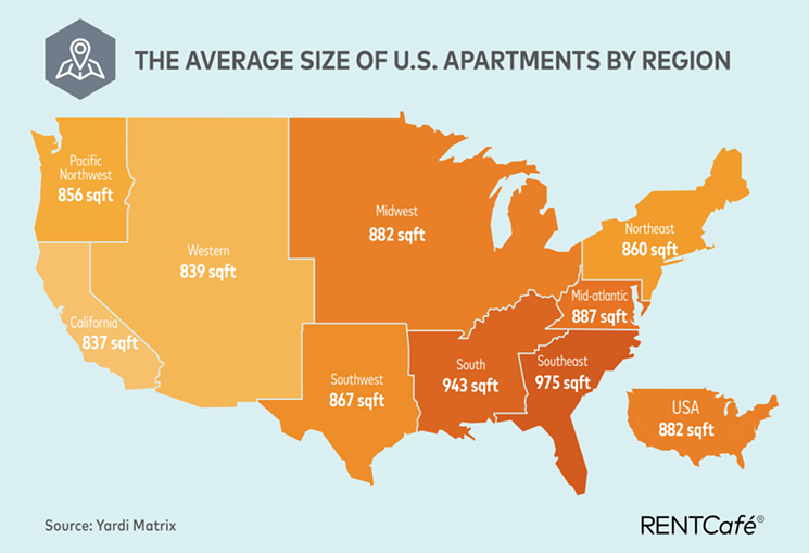
50% is a fairly significant appreciation in price. Imagine this: You buy a home in 2008 for $300,000. Today, if it went up 50% in value, the home would be worth $450,000. That would be a great investment! But what happens if you didn’t buy in 2008 and are looking to buy now? The prices are more expensive. The Dallas Observer also shared a map of the average size of U.S. apartments by region. Let’s take a look.
Median Apartment Size Map

From a quick glance of the map, one thing is certain: “Everything’s bigger in Texas” except apartment size. The average square footage of an apartment in the Texas region is 867. Overall, the average square footage of an apartment in the U.S. is 882. The Southeast is the big winner with an average of 975 square feet. California, on the other hand, has the least average square foot coming in at 837. Maybe that’s part of the reason so many people are migrating from California to Texas.
Stephen Young continues, “in Dallas proper, the average apartment built in 2008 was 1,033 square feet. This year, the average new apartment measured 952 square feet, a change in size of 8 percent. The overall average apartment size in Dallas is 832 square feet.”
We saw earlier that the Texas region has an average square footage of 867. Dallas coming in at 832 puts the city under the average of the region. As a matter of fact, the average square footage of an apartment in Dallas is comparable to that of an apartment in the California region (837 square feet).
Median Apartment Size Map (also featured photo) is a screenshot by RPS Relocation
Dec
Most Expensive Cities for Commuting in the USA
Jason C. 0 comments Dallas, Data Visualization, Maps, Moving News, Seattle
What’s your daily commute like? If you live in or near a major city, traffic is probably a fact of life. Back in August, we shared how much time people of major cities waste over the course of their lives by commuting. The data was put together by EducatedDriver.org. Now, they’re back with more information about your commute; however, this time, they share how much money you spend on gas and vehicle maintenance.
Recall that the average American spends about 408 days commuting. That’s over an entire year of their life driving! In addition to spending time, people also spend money as they drive. Alex Lauderdale writes, “We did the math for nearly 100 major US cities, and found the average American will spend $108,727 on gas and vehicle maintenance costs associated with commuting while driving 173,203 miles to and from work in their lifetime. That’s enough miles to drive around the world 7 times!”
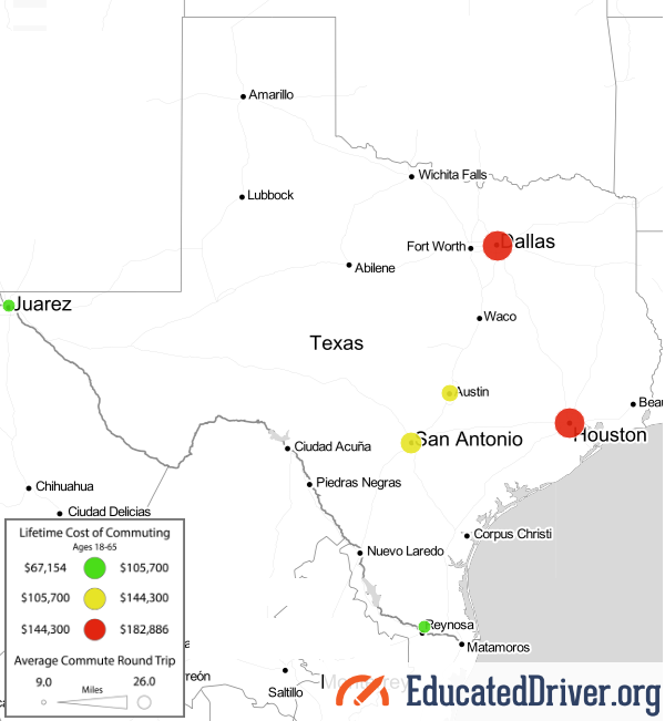
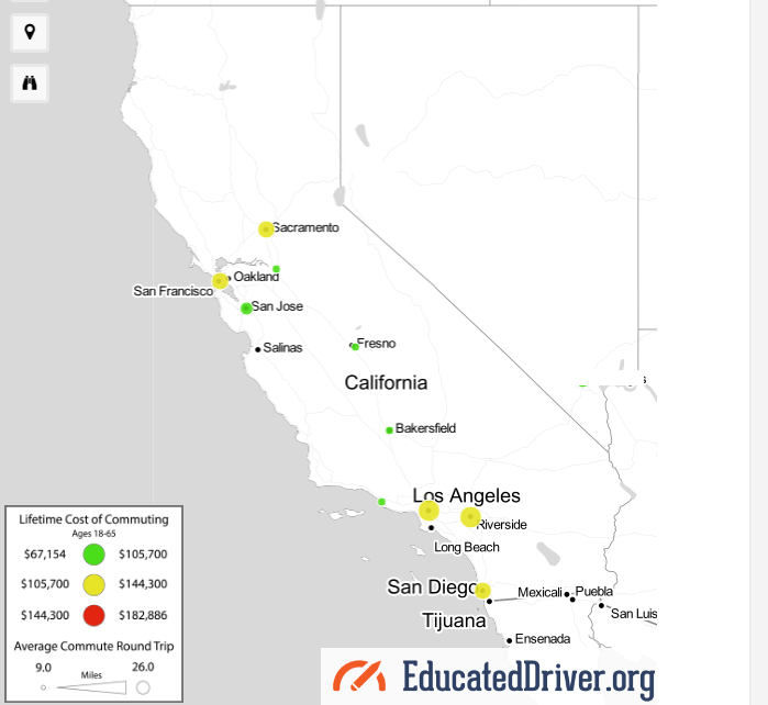
Lifetime Cost of Commuting Map

A quick glance at the map above shows this: red, yellow, and green circles. The circles represent the lifetime cost of commuting in a certain city. The red circles indicate the most expensive cities, the yellow circles indicate more of the average-costing cities, and the green circles indicate cities that are least expensive for commuting.
The lifetime cost of commuting is most in Atlanta. The average round-trip there is 26 miles and the average cost of commuting there is a whopping $182,886. Let’s take a look at some other areas.
Texas has six cities on the map: Dallas, Houston, San Antonio, Austin, El Paso, and McAllen. Texas is the only state that has two large red circles which cover Dallas and Houston. Check out a photo of Texas below.
California is the state with the most cities on the map. The ten circles cover the following cities: Sacramento, Stockton, San Francisco, San Jose, Fresno, Bakersfield, Oxnard, Los Angeles, Riverside, and San Diego. We often hear about how bad the traffic can be in Los Angles; however, the city has a yellow circle. As a matter of fact, California has no red circles at all. See the photo of the state below.
Top 30 Expensive Cities for Commuting
Where are the most expensive cities for commuting? You have to click each circle to determine exactly how expensive the city is for commuting. To make better sense the map, we turned a large part of the data into a list.
Below, you’ll find the top 30 most expensive cities for commuting. As stated earlier, Atlanta is the most expensive, followed closely by Dallas, Houston, and Phoenix. Check it out as the list goes from most expensive to least:
- Atlanta, GA – $182,886
- Dallas, TX – $174,314
- Houston, TX – $174,314
- Phoenix, AZ – $162,883
- Nashville, TN – $157,168
- Detroit, MI – $148,595
- Birmingham, AL – $144,309
- Chicago, IL – $142,880
- St. Louis, MO – $142,880
- Charlotte, NC – $138,594
- Minneapolis, MN – $135,736
- Indianapolis, IL – $131,450
- Orlando, FL – $130,021
- Knoxville, TX – $130,021
- Washington, DC – $130,021
- Jacksonville, FL – $130,021
- Riverside, CA – $130,021
- Seattle, WA – $128,592
- Columbia, SC – $128,592
- Kansas City, MO – $127,163
- Memphis, TN – $127,163
- San Antonio, TX – $125,734
- Los Angeles, CA – $125,734
- Jackson, MS – $124,306
- Richmond, VA – $124,306
- Cincinnati, OH – $124,306
- Austin, TX – $122,877
- Baltimore, MD – $122,877
- Columbus, OH – $122,877
- Miami, FL – $122,877
The Methodology of the Map
How did EducatedDriver.org come up with the data used to compile the map? Alex Lauderdale writes, “For the purposes of this study, we assumed the average person starts full-time work at 18 (some people start earlier, others a bit later). We also know the average retirement age is 63 in the United States. That works out to a total of 45 years working a full-time job.”
This tells us that the data isn’t precise; however, it’s essentially as estimate based upon common knowledge such as the average retirement age and total years the average person works.
Alex continues, “From there, we operated based on the assumption most people work about 250 days per year, accounting for 2 weeks yearly vacation and time off. That adds up to a whopping 11,250 days of working/commuting over a career.”
Again, we’re seeing best estimates based upon data averages. Not everyone has exactly 2 weeks of vacation each year. Some people have more vacation than that and not everyone uses all of their vacation days.
Finally, Alex pulled data about the average round trip distances as well as how much it costs per mile to drive a vehicle. He writes, “we used data from the US Census Bureau on average daily round trip commute distances as well as data from AAA on the total cost per mile of operating a vehicle (60.8 cents per mile for the average sedan when gas, insurance, and maintenance costs are considered).”
How does your city commute compare with the rest of the country? Do you live near a red, yellow, or green circle? We’re interested in your experience and want to know if it lines up with the data! Use the comments area below to share your story.
Map photos are screenshots by RPS Relocation
Dec
The World Series, Super Bowl, and Stanley Cup are among the pinnacles of sports. These championship events give way to heightened emotion, excitement, and, ultimately, victory or defeat plunging cities into mourning, jubilation, and sometimes anarchy-esque chaos. The larger cities across the country normally have a healthy amount of sports teams and fans that eagerly pursue winning one of these crowns. Others, not so much. Which U.S. cities are the best for sports? In an attempt to answer this, Wallet Hub put together 2018’s best cities for sports.
Adam McCann of WalletHub explains the methodology in picking the best cities. In a nutshell, he writes, “each sports category was assigned a weight corresponding with the total percentage of adults in the U.S. who claim to follow that particular sport, according to The Global Sports Media Consumption Report”.
The sports we are going to highlight are football, basketball, baseball, hockey, and soccer.
Mapping the Best Cities for Sports
Wallet Hub ran the data to create a visualization of what their findings look like on a map. As you can see, circles — some larger than others — dot the landscape. The larger circles indicate best sports cities that overall rank lower on the list. The smaller circles, like Boston, Chicago, and Los Angeles, indicate cities that are the best of the best when it comes to sports cities.
At a quick glance, it looks like the best cities listed are more or less in tune with the general population size. For example, circles are found up and down the east coast stretching all the way to the Midwest. After that, there are cities few and far between until arriving on the west coast. On the east coast, California has the most of these best cities for sports.
The Best Cities for Football

The Philadelphia Eagles won 2018’s Super Bowl and the city ranks 8th on the list of best cities for football. The Green Bay Packers, a legendary team that is owned by the fans in a city of just over 100,000 people, have the top spot. The #2 slot goes to the Steel City where the Pittsburgh Steelers and their fan are always revved up for game day. Dallas takes the #3 spot even though the professional NFL team that has their name is actually about 20.5 miles away in Arlington, TX. The Cowboys and their fans call themselves “America’s Team” which may have been more true in the 90’s than it is today where “Most of Texas’ team” is likely more fitting. Still the city of Dallas’ mood often fits with how well the Cowboys played the week before and much of the area pays close attention to every decision the team makes. The New England Patriots out of Boston, MA sit just outside of the top 3 spots at #4. The team has competed in the Super Bowl eight times in the last twenty years, out of those appearances they have won five NFL championships.
Here are the top 30 best cities for football:
- Green Bay, WI
- Pittsburgh, PA
- Dallas, TX
- Boston, MA
- New York, NY
- Los Angeles, CA
- Glendale, AZ
- Philadelphia, PA
- Oakland, CA
- Cincinnati, OH
- Atlanta, GA
- Seattle, WA
- New Orleans, LA
- Washington, DC
- Indianapolis, IN
- Miami, FL
- Kansas City, MO
- Minneapolis, MN
- Charlotte, NC
- Nashville, TN
- Buffalo, NY
- Cleveland, OH
- Baltimore, MD
- San Francisco, CA
- Detroit, MI
- Tampa, FL
- Chicago, IL
- Denver, CO
- Houston, TX
- Jacksonville, FL
The Best Cities for Basketball

The #1 Los Angeles Lakers were to the 2000s what the Chicago Bulls were to the 1990s. Coach Phil Jackson and players Shaquille O’Neal and Kobe Bryant propelled the Lakers to three straight championship wins. The Lakers won five championships from 2000-2010. #2 Boston Celtics saw legendary basketball champion Larry Bird play for the team; however, the Celtics were good even before he joined. The Celtics won the NBA Finals an amazing 8 times in a row from 1959-1966. The #3 Golden State Warriors (Oakland, CA) are the hottest team in basketball right now. They won 2018’s NBA Finals. The Warriors also won in 2015 and 2017. Steve Curry is to the Warriors what Michael Jordan was to the Chicago Bulls.
Here are the top 30 best cities for basketball:
- Los Angeles, CA
- Boston, MA
- Oakland, CA
- San Antonio, TX
- Salt Lake City, UT
- Miami, FL
- Oklahoma City, OK
- Chicago, IL
- Cleveland, OH
- Philadelphia, PA
- New York, NY
- Washington, DC
- Dallas, TX
- Houston, TX
- Atlanta, GA
- Indianapolis, IN
- Orlando, FL
- Portland, OR
- New Orleans, LA
- Sacramento, CA
- Milwaukee, WI
- Detroit, MI
- Chapel Hill, NC
- Lawrence, KS
- Memphis, TN
- Minneapolis, MN
- Durham, NC
- Charlotte, NC
- Denver, CO
- Lexington, KY
The Best Cities for Baseball

The Boston Red Sox won 2018’s World Series and ranks at number 8 in the best cities for baseball. The Red Sox have competed in the championship game twice in the past 10 years. They won both times. Their rivals are the New York Yankees. #1 New York is home to the Yankees and Mets. #2 Los Angeles is home to the Angels and they’ve only had one World Series win (2002). The team became more popular after the 1994 movie “Angeles in the Outfield”. The #3 St. Louis Cardinals have won numerous championship games; however, the lost in 2003 to the current champs (Boston Red Sox).
Here are the top 30 best cities for baseball:
- New York, NY
- Los Angeles, CA
- St. Louis, MO
- Atlanta, GA
- Chicago, IL
- San Francisco, CA
- Cincinnati, OH
- Boston, MA
- Pittsburgh, PA
- Arlington, TX
- Oakland, CA
- Minneapolis, MN
- Detroit, MI
- St. Petersburg, FL
- Baltimore, MD
- Milwaukee, WI
- Cleveland, OH
- Philadelphia, PA
- San Diego, CA
- Kansas City, MO
- Phoenix, AZ
- Houston, TX
- Denver, CO
- Seattle, WA
- Washington, DC
- Miami, FL
- Buies Creek, NC
- Spokane, WA
- Annapolis, MD
- Durham, NC
The Best Cities for Hockey

The Washington Capitals won 2018’s Stanley Cup and the city ranks at number 10 in the best cities for hockey. The Chicago Blackhawks are notable because they won the championship game three times in the last ten years. The #1 Boston Bruins have played in the Stanley Cup 19 times and won 6 of them. The #2 Detroit Red Wings, however, won even more championship games. The Red Wings have played in the Stanley Cup 24 times and won 11 of them. Finally, the #3 Pittsburgh Penguins have played in the finals only 6 times; however, the Penguins won 5 out of 6 of those games. That gives the Penguins a better win percentage over the Bruins and Red Wings.
Here are the top 30 best cities for hockey:
- Boston, MA
- Detroit, MI
- Pittsburgh, PA
- New York, NY
- Chicago, IL
- Newark, NJ
- St. Louis, MO
- Buffalo, NY
- Anaheim, CA
- Washington, DC
- Philadelphia, PA
- San Jose, CA
- St. Paul, MN
- Denver, CO
- Sunrise, FL
- Tampa, FL
- Los Angeles, CA
- Las Vegas, NV
- Dallas, TX
- Glendale, AZ
- Nashville, TN
- Raleigh, NC
- Columbus, OH
- Ann Arbor, MI
- Durham, NH
- Grand Forks, ND
- Lewiston, NY
- Hamilton, NY
- Hanover, NH
- Orono, ME
The Best Cities for Soccer

Toronto FC is 2018’s MLS Cup winner. While a North America Soccer team, Toronto is not applicable to the best cities map because it only covers the United States. The top spot for soccer is held by Los Angeles whose team, LA Galaxy, has won the MLS Cup three times in the last ten years. #1 LA Galaxy is popular in part due to having international soccer star David Beckham as a former player. He helps the Galaxy win two straight MLS Cups (2011 and 2012). The #2 Orlando City Lions only became a team 5 years ago, in 2013. The demographic and local support for soccer lead to the creation of the team. Finally, the #3 Seattle Sounders is also a relatively new team. The Sounders were formed 11 years ago, in 2007, for the same reasons as the creation of the Orlando Lions. Soccer is becoming more popular in the U.S.!
Here are the top 30 best cities for soccer:
- Los Angeles, CA
- Orlando, FL
- Seattle, WA
- Portland, OR
- New York, NY
- Salt Lake City, UT
- Washington, DC
- Kansas City, MO
- Atlanta, GA
- Chicago, IL
- Houston, TX
- Columbus, OH
- Cary, NC
- Minneapolis, MN
- Boston, MA
- Dallas, TX
- San Jose, CA
- Denver, CO
- Philadelphia, PA
- Piscataway, NJ
- Cincinnati, OH
- Louisville, KY
- Sacramento, CA
- Charleston, SC
- Miami, FL
- Richmond, VA
- St. Louis, MO
- Bethlehem, PA
- San Antonio, TX
- Tulsa, OK
Dallas, Seattle, Las Vegas, Kansas City, and Chicago
If you’be been following our blog, you know that these cities are great places to live for various reasons. Where do they stand as the best cities for sports? Check them out below.
- Dallas—Football: 3; Basketball: 13; Baseball: 177; Hockey: 19; Soccer: 16
- Seattle—Football: 12; Basketball: 83; Baseball: 24; Hockey: 450; Soccer: 3
- Las Vegas—Football: 197; Basketball: 198; Baseball: 89; Hockey: 18; Soccer: 43
- Kansas City—Football: 450; Basketball: 450; Baseball: 450; Hockey: 450; Soccer: 45
- Chicago—Football: 27; Basketball: 8; Baseball: 5; Hockey: 5; Soccer: 10
Featured photo is a screenshot of Wallet Hub sports map by RPS Relocation
All sports photos by CC0 Creative Commons on Pixabay
Map of best sports cities is embedded from WalletHub

Dec
The United States has one of largest land masses of any country in the world. Our country has vast mountains, plains, deserts. Puerto Rico—a territory of the United States—is home to the only tropical rain forest in North America. What is all of this land used for? Bloomberg pulled data from a number of sources to determine to answer this question.
Sure, a percentage of land is allotted for residential or business use. With the amount of traffic in some areas, it can seem as if our country is overpopulated; however, as Bloomberg learned from the data, that’s not the case.
Six Land Types
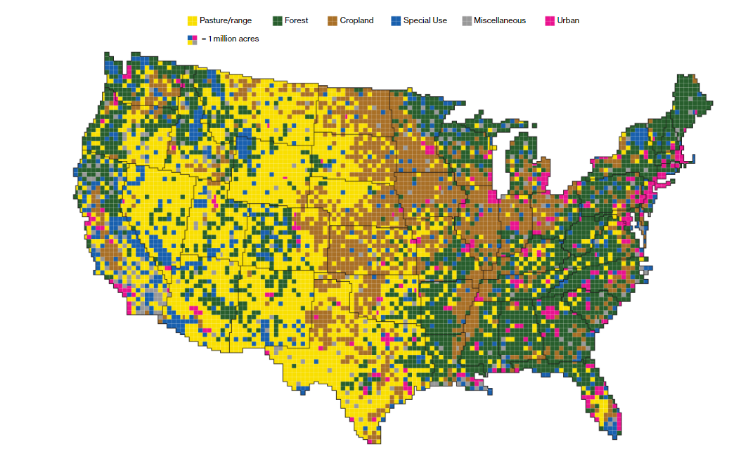
Bloomberg authors Dave Merrill and Lauren Leatherby write, “Using surveys, satellite images and categorizations from various government agencies, the U.S. Department of Agriculture divides the U.S. into six major types of land. The data can’t be pinpointed to a city block—each square on the map represents 250,000 acres of land. But piecing the data together state-by-state can give a general sense of how U.S. land is used”.
These six land types are:
- Pasture/range
- Forest
- Cropland
- Special Use
- Miscellaneous
- Urban
The map clearly shows urban areas are a minority compared to the rest, just by looking at the colored squares. Miscellaneous and special use areas have fewer squares than forest, cropland, or pasture and range zones. Bloomberg was able to collect the acreage for each land type.
Acreages of the Land Types
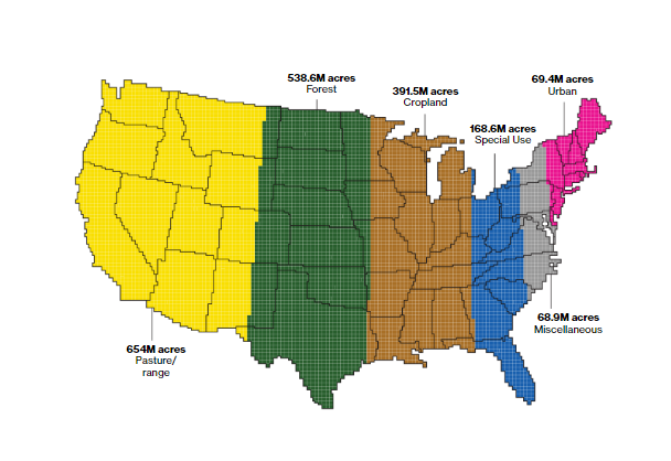
Imagine if you were able to view each land type together on the map. That’s what you get in the photo above. Here, it’s proven that urban areas are indeed the smallest and pasture and ranges are the largest. How many acreages does each land type contain? Here’s the breakdown:
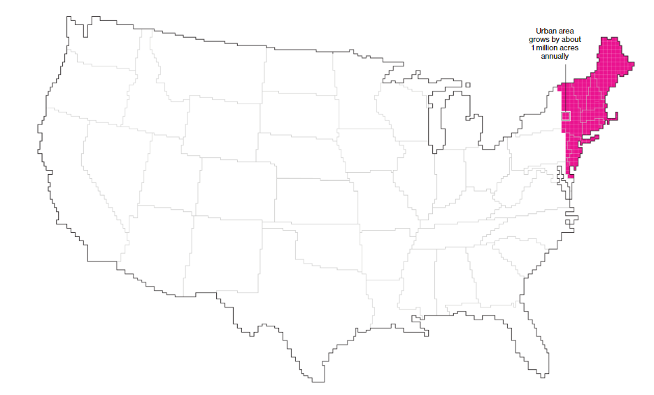
- Urban: 69.4M acres
- Miscellaneous: 68.9M acres
- Special Use: 168.6M acres
- Cropland: 391.5M acres
- Forest: 538.6M acres
- Pasture/range: 654M acres
“Four in five Americans live, work and play” in urban areas, write Merrill and Leatherby. Given this fact, most Americans would be able to fit in a relatively small area of the country, in theory. Urban areas are growing quickly, however. Merrill and Leatherby continue, “The U.S. is becoming more urban—at an average rate of about 1 million additional acres a year. That’s the equivalent of adding new urban area the size of Los Angeles, Houston and Phoenix combined. U.S. urban areas have more than quadrupled since 1945”.
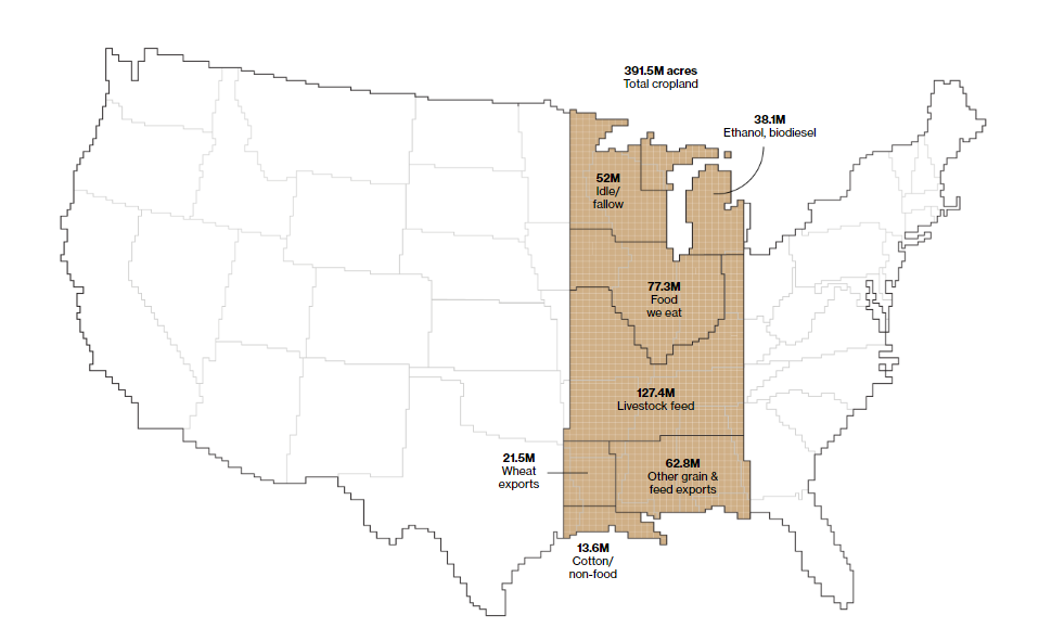
Food Production and Land
Around one-fifth of the land in our country is agricultural land and most of it is located in the Midwest. However, only a small percentage of agricultural land is currently used to feed Americans. Some of the land is used for ethanol production or livestock feed. Other land is used to cultivate crops with the goal of exporting them to other countries. Here’s a breakdown of what our cropland is used for:
- Livestock feed: 127.4M acres
- Food we eat: 77.3M acres
- Other grain & feed exports: 62.8M acres
- Idle/fallow: 52M acres
- Ethanol, biodiesel: 38.1M acres
- Wheat exports: 21.5M acres
- Cotton/non-food: 13.6M acres
Here’s a photo of this data visualized:
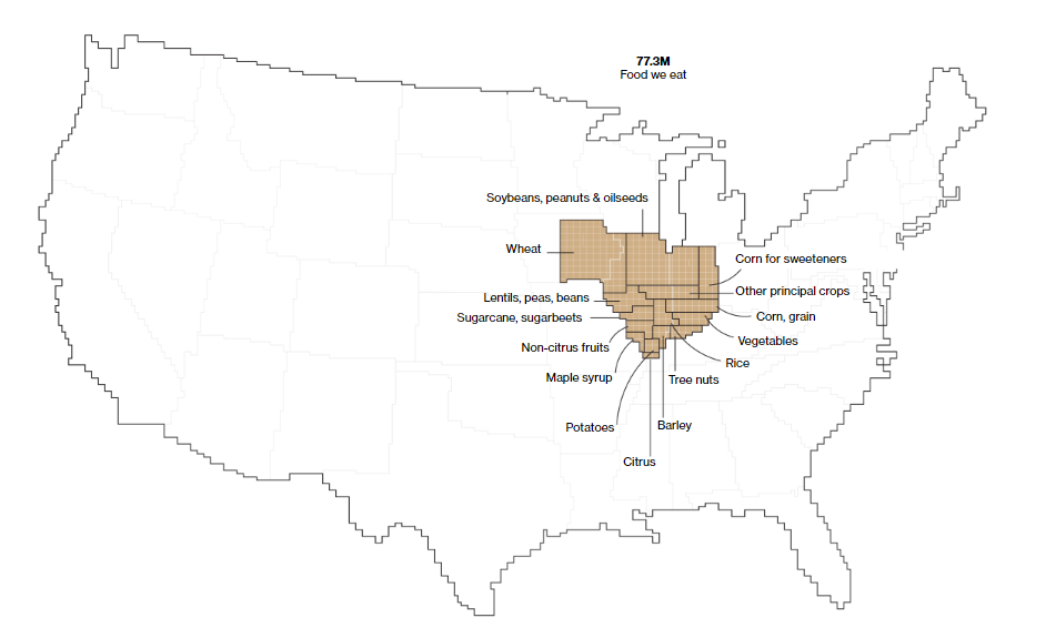
Let’s zoom in on the food we eat. In the photo below, you can see wheat, non-citrus fruits, vegetables, rice, sugarcane, and a few other types of foods. Wheat, soybeans, peanuts, and oilseeds appear to be about half of what we eat. Barley, maple syrup, potatoes, and citrus are among the least of what we consume.
Featured photo by CC0 Creative Commens on Pixabay
Bloomberg data map photos are screenshots by RPS Relocation

Nov
Energy helps makes the world turn. Maybe that why every state in our country produces it; however, not all energy is equal when it comes to being green and environmentally friendly. Reddit user Dr_Engineerd shared a map of the United States. Specifically, the map details the percentage of electricity produced by non-fossil fuel sources. The data comes from U.S. Energy Information Administration. Let’s take a closer look at the map!
The Non-fossil Fuel Energy Map
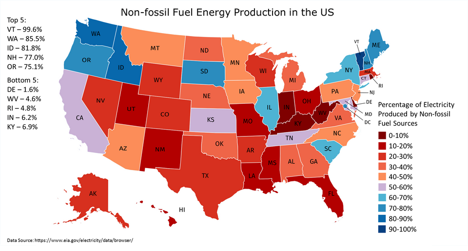
Each state on the map is depicted by a certain color. The redder states are those which have a low percentage of non-fossil fuel energy production. The bluer states, on the other hand, of those which have a higher percentage of non-fossil fuel energy production.
Most of the states in the Midwest, with the exception of Illinois and South Dakota, lean towards the red end of the color spectrum. This means the electricity of those states is produced by a higher amount of fossil fuel energy. The northern states on both coasts trend bluer. The electricity there is produced by more non-fossil fuel energy.
Highest and Lowest States by Percentage
A cursory glance at the map will give you an idea where each state stands. After all, the color of the state indicates the type of fuel sources it uses (fossil fuels versus non-fossil fuels). To get a better idea of fuel sources, it’s best to get the actual percentage of electricity produced by non-fossil fuel sources. Below are the states which have the most, and least, percentages of electricity produced by non-fossil fuel sources.
Top 5 non-fossil fuel states:
- Vermont (99.6%)
- Washington (85.55%)
- Idaho (81.8%)
- New Hampshire (77%)
- Oregon (75.1%)
Bottom 5 non-fossil fuel states:
- Delaware (1.6%)
- West Virginia (4.6%)
- Rhode Island (4.8%)
- Indiana (6.2%)
- Kentucky (6.9%)
Comments and Thoughts
Reddit user Dr_Engineerd explains the types of non-fossil fuel energy sources. Solar, wind, biomass, geothermal, and hydroelectric are common types of green energy. Nuclear energy also falls into this category in part because it’s emission-free.

Dr_Engineerd also shared what the map would look like without including nuclear. See it below.
![]()
Another Reddit user, jswynn5, has an interesting take on the energy product of Texas. Jswynn5 writes, “Side note, I used to live in Texas, they are the largest wind energy producers in the US. Unfortunately it doesn’t come close to how much fossil fuel energy they produce. Just interesting facts”.

Featured photo by Pixabay on Pexels
Non-fossil fuel energy map and Reddit comments are screenshots by RPS Relocation

Nov
The Green Energy Map of Canada
Jason C. 0 comments Maps
How green is Canada’s energy? When it comes to energy, let’s just say it depends on the province. Like the individual states in the United States, the provinces in Canada are diverse next to each other. Reddit user PaulsEggo posted an image visualizing how green each province is.
The Province Map
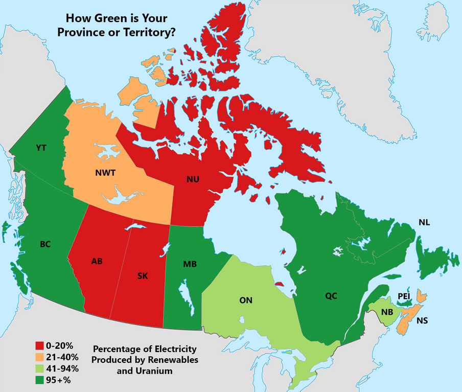
The provinces vary in color from red to light orange to light green to green. The red provinces are those which have a low percentage of electricity produced by renewables and uranium. The green, on the other side of the spectrum, are provinces which have a high percentage of electricity produced by renewables and uranium. Here are exact percentages for each color:
- Red: 0-20%
- Light Orange: 21-40%
- Light Green: 41-94%
- Green: 95+%
Territorial Statistics Chart
Reddit user PaulsEggo created the map visualization; in addition, he created the following provincial and territorial statistics chart.
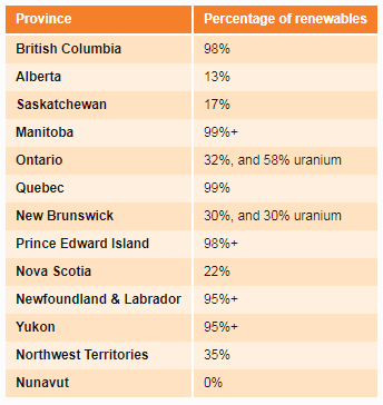
It’s important to note that uranium and nuclear energy are considered clean energy. The chart is based on the data PaulsEggo collected from the National Energy Board (NEB). NEB writes, “Canada is rich in energy supply. From the hydroelectric reservoirs of British Columbia, Manitoba, Ontario, and Quebec to the hydrocarbon resources of western Canada and offshore East Coast. From the uranium deposits in northern Saskatchewan to the abundant wind and solar potential across the country. This wealth of resources ranks Canada as the fifth largest natural gas producer, sixth largest crude oil producer, second largest hydro producer and sixth for share of renewable electricity generation.”
Alberta, Saskatchewan, and Geography
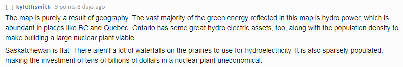
Alberta and Saskatchewan are among the provinces colored in red in the map. One Reddit user, Tamer_, commented “They’re still burning 87% of the coal and 72% of the natural gas used for power in Canada”.

Another Reddit user, kylethsmith, commented how geography plays a role in having clean energy. They write, “The map is purely a result of geography. The vast majority of the green energy reflected in this map is hydro power, which is abundant in places like BC and Quebec. Ontario has some great hydro electric assets, too, along with the population density to make building a large nuclear plant viable. Saskatchewan is flat. There aren’t a lot of waterfalls on the prairies to use for hydroelectricity. It is also sparsely populated, making the investment of tens of billions of dollars in a nuclear plant uneconomical”.
Featured photo by Daniel Joseph Petty on Pexels
Canada visualization map, statistics chart, and Reddit comments are screenshots by RPS Relocation

Nov
Dallas Map Startup Shows Critical Data in One Place
Jason C. 0 comments Dallas, Data Visualization, Maps
Knowledge is power! And in our Information Age, data is the new form of knowledge. This data is being used to make humanity better. Technological advances are moving at the speed of Moore’s Law which sees computer power doubling every two years.
Data can be used to improve the lives of people at the federal, state, and local levels. One of the ways to determine where data will encourage positive action is to actually see the data. This can be accomplished by creating a data visualization on a map.
For Dallas, Texas, this such data visualization has become a reality. A substantial number of data sets have been collected with the goal of making the city better. This visualization is called TheMap. D Magazine gives us some background of how the map came to be.
Improving Dallas with a Map
Robert Mundinger, a longtime resident of Dallas, noticed problems in the areas he lived in. Matt Goodman of D Magazine wanted to learn more about TheMap from Mundinger.
Matt writes, TheMap is “an open-source, interactive web portal that allows users to access an array of data sets that can help people better understand all sorts of things about Dallas. The data sets can be used to generate maps. It’s all exportable. “A kid’s educational outcome is dependent on education and crime and health and access to food, access to internet, libraries,” Mundinger says. “All these variables affect each other so much that there needs to be one place where people can look at them together and analyze them.”
What Mundinger wants to achieve in simple: Highlight at-risk areas of the city. In addition, and while he was at it, Mundinger went ahead and included more data set that might be of use.
There are neighborhoods in Dallas which have a high concentration of poverty. This is included in the map visualization. There are intersections that have more fatal pedstrian crashes than others. This is also included in TheMap. There’s even data about where there are working females over the age of 16. The information contained within TheMap is comprehensive!
Let’s take a closer look at the data sets available for viewing.
Data Sets in TheMap
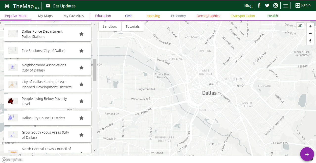
Police stations, fire stations, neighborhood associations, poverty areas—these are some of the data sets that are included in TheMap. Take a look at the column on the left to see them all. TheMap defaults to Popular Maps whe you visit the website.
You can otherwise click on Education, Civic, Housing, or other major types of data sets. Check out the row near the top to see more.
Once you click a data set, the information will be uploaded to the map. Let’s say you click on police departments. Pinpoints of every police department in Dallas will show up on the map. You can click them individually to get the name, address, and more information about the particular police department.
Bus Stops in Dallas
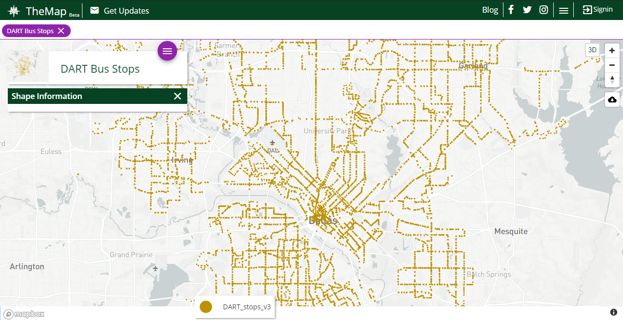
One of my favorite visualizations in TheMap is seeing where DART bus stops are. DART—which stands for Dallas Area Rapid Transit—seemingly has bus stops all over the city. A quick glance shows what can be estimated to over 100 bus stops.
This data set is surely important to Mundinger. After all, he’s concerned with increasing the access of public services to all residents of Dallas, including those below the poverty line. With TheMap, Dallas city officials can combine areas of poverty with bus stop locations. If there’s an area which is lacking of public transportation, DART could add a new bus stop there.
Combining Datasets in TheMap
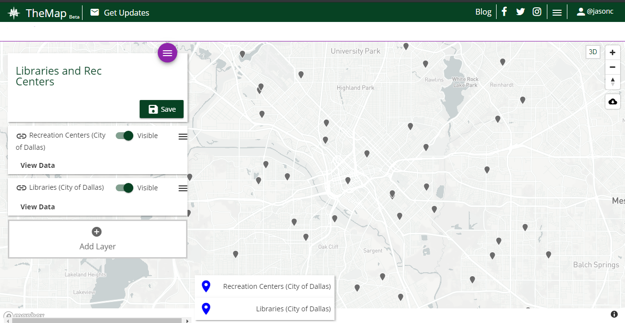
One of the most powerful and helpful features of TheMap is the ability to combine and layer multiple datasets. To do this, you’ll need to create an account which only takes a minute.
Let’s say I want to see the locations of libraries and recreation centers. People considering a move to Dallas may enjoy both of these placs and want to live near them. See the screenshot of TheMap to see how it looks when you combine data sets.
Notice that recreation centers and libraries are shown on the left side. In the screenshot, they’re both toggled as being “Visible” in TheMap. You can toggle either of them on or off to show their exact locations. Or, you can click on each pin to gain further information.
Final Thoughts on TheMap
Robert Mundinger has done a great, free public service to the city of Dallas. City officials should be using TheMap before they make decisions that will affect the residents of the city. For example, a new police station can be built near an area of high crime.
Dallas isn’t the only city that can benefit from using TheMap. Mundinger, or people inspired by him, can take this idea and apply it to virtually any city. It would all be in the name of improving the lives of residents over an extended period of time.
Featured photo by Aksonsat Uanthoeng on Pexels
TheMap photos are screenshots by RPS Relocation

Nov
A Majority of Americans Say Renting is More Affordable Than Owning a Home
Jason C. 0 comments Moving News
Is it better to rent or buy a home? It’s a simple question; however, there are many factors involved. Your situation is different from a great number of people. Income and age play a role in answering that question. Interest rates and location also play a role. Near term and long term goals have to be taken into consideration. Will you be in the area for a year or two? Or will you plant your feet for a decade or more? Numerous organizations—Freddie Mac, Forbes, and others—have studied this age-old question.
Let’s take a deeper look at the findings of Freddie Mac and Forbes.
Current Surveys and Research
Freddie Mac—otherwise known as the Federal Home Loan Mortgage Corporation—commissioned Harris Poll to conduct a survey of people in the housing market. The survey was conducted online from August 13-15, 2018. This is the second such survey that was conducted this year (the first being from January 30-February 1, 2018). This recent survey took the pulse of 4,040 people over the age of 18. It also included 1,059 renters. Let’s read some of the results.
“According to the survey, 78 percent of renters believe renting is more affordable than owning – up a stunning 11 points from just six months ago in February 2018. This is the case even as the majority of renters (66 percent) reported difficulty affording their rent at some point over the past two years. The survey found nearly 9 in 10 renters employed in the essential workforce, such as health care and education, had significant difficulty affording the rent over the past two years.”
The fact that most renters believe mortgages are most expensive shouldn’t be surprising. What is surprising, however, is the fact that this belief jumped by 11 points in the past six months! Rising interest rates may be to blame. After all, the 30 Year Mortgage Rate jumped from 3.95% in January to 4.86% in November 2018. If mortgage rates continue to rise homes will become less affordable; however, renters will feel the squeeze too.
Best Cities for Renting or Owning
There are certain areas around the United States where it’s better to rent. On the other hand, there are places where it’s better to own. Forbes took a magnifying glass to this issue and found out where these cities are.
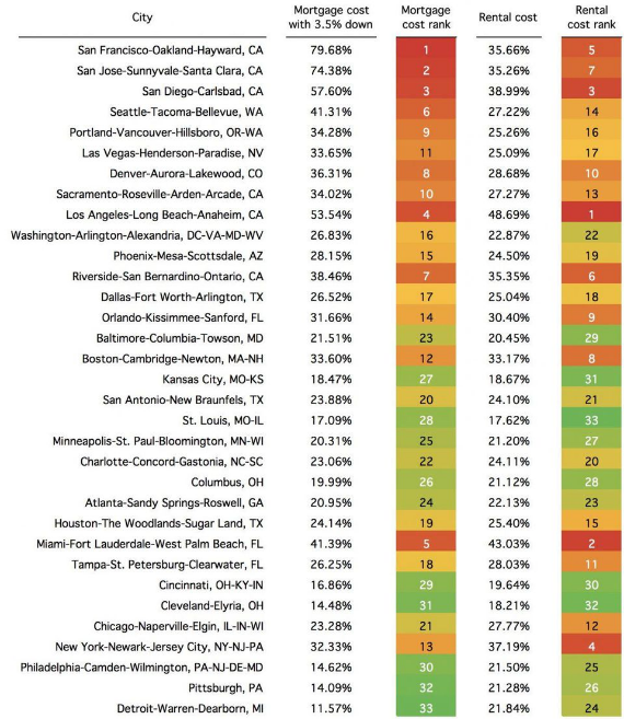
Amy Dobson included a visualization of rent gaps in the 33 largest metropolitan statistical areas. See it below.
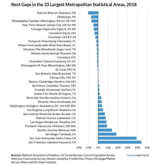
Amy writes, “So what does this chart mean? The numbers listed here are percentage points—so for the San Francisco example, the difference between the percentage of salary a renter would spend versus a buyer is about 45 percentage points difference. The chart shows percentages of income. Looking at San Francisco, a buyer would have to spend 79.68% of the median income on monthly housing payments whereas a renter would spend only 35.66% of median income. Of course, most people aren’t spending nearly 80% of their income on housing (let’s hope not), but the statistic is a useful way to compare rents versus mortgage payments just to see how big a jump it takes to become a homeowner in some of the largest cities in America.”
This means the cities at the top of the visualization are the ones where it’s cheaper to rent a home. The cities at the bottom of the visualization are the ones where it’s cheaper to have a mortgage.
Income Required for a Mortgage in Cities
Prices of the housing market are vastly different depending on which area of the country to you live. For example, buying homes is more expensive in San Diego than buying a home in Pittsburgh. Forbes listed in the 33 most expensive major cities for having a mortgage. Here they are in order:
- San Francisco, CA
- San Jose, CA
- San Diego, CA
- Los Angeles, CA
- Miami-Fort Lauderdale, FL
- Seattle, WA
- Riverside, CA
- Denver, CO
- Portland, OR
- Sacramento, CA
- Las Vegas, NV
- Boston, MA
- New York, NY
- Orlando, FL
- Phoenix, AZ
- Washington, DC
- Dallas-Fort Worth, TX
- Tampa, FL
- Houston, TX
- San Antonio, TX
- Chicago, IL
- Charlotte, NC
- Baltimore, MD
- Atlanta, GA
- Minneapolis, MN
- Columbus, OH
- Kansas City, KS
- St. Louis, MO
- Cincinnati, OH
- Philadelphia, PA
- Cleveland, OH
- Pittsburgh, PA
- Detroit, MI
The cities listed above are in order based on mortgage cost rank. To better understand their placement, see the full visualization below. Amy also writes the chart below “shows the share of median income each city would require to buy a home. Researchers assumed a thirty-year mortgage, 3.5% down payment, 4.57% interest rate and property tax and insurance rate at 1.75% of the home’s value.”
In addition to the cost of mortgages, the chart also lists cities where it’s most expensive to rent. Los Angeles is the most expensive city to rent a home in. From the list, St. Louis is the least expensive city for renters. See more below.
Feature photo by David Jakab on Pexels
Forbes rent gaps photo and cost of mortgages photo are screenshots by RPS Relocation

Oct
Uhaul Prices Are Wildly Different Between Dallas and San Francisco
Jason C. 0 comments Dallas, Moving News
Prices for the same goods and services are not normally far apart; however, prices in some areas of the country are vastly more expensive than elsewhere. Case in point: The cost of living in California is generally more than it is in Texas. This is true for home prices, child care, medical care, and even the price of renting a Uhaul.
Uhaul prices are vastly different in the two states, actually. KXAN—a Texas news outlet—wanted to dig a little deeper regarding this disparity in their article “Why it’s 4x as much to rent moving truck from CA to TX than reverse“.
Examining the Prices
You can already see from the article title that prices for Uhaul rentals are more expensive in California. Chris Davis—writer of the article—shared that KXAN used Uhaul’s online estimate tool to determine price differences between renting a vehicle from San Francisco to Austin, and back.
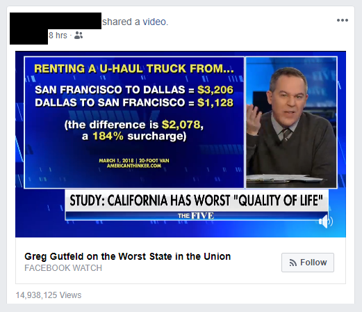
Chris writes, “The cost to get a 26-foot truck (enough to move a house full of stuff) to San Francisco from here is $1,150; the reverse trip costs close to four times as much, at $4,380. The cost from Los Angeles to Austin is almost five times as much.” These prices are a factor to people considering a move to Los Angeles from Austin or from Austin to Los Angeles. It’s the same factor as with people moving from San Francisco to Dallas, as shown above.
When we checked on October 29th, 2018 here’s what the prices looked like:
San Francisco to Dallas
- 10 foot truck: $2,031.00
- 15 foot truck: $2,138.00
- 20 foot truck: $3,206.00
- 26 foot truck: $4,275.00
Dallas to San Francisco
- 10 foot truck: $974.00
- 15 foot truck: $1,026.00
- 20 foot truck: $1,128.00
- 26 foot truck: $1,282.00
We were able to determine that prices for Boston, MA, which is roughly as far away from Dallas as San Francisco (Boston is 1,768 miles away vs. San Francisco at 1,732 miles away), are much cheaper. Currently a 26 foot UHaul truck from Boston to Dallas is $1,797 or $2,478 less expensive than moving to Dallas from San Francisco with the same UHaul truck.
Why is there such a difference in prices? KXAN reached out to Uhaul for an explanation. They didn’t get a breakdown; however, KXAN received an indication why there are such large price differences. Chris writes, “U-Haul did not provide anyone for an interview about the price difference but told KXAN in an emailed statement that supply and demand plays a big role in how much it costs to get from place to place.”
I suppose the question is this: Why is the demand so high for Californians to move to Texas? Texas Senator Ted Cruz thinks he has the answer.
Ted Cruz’s Theory and Migration of the California Population

Senator Cruz is currently running for reelection in Texas. His opponent, Robert Francis “Beto” O’Rourke, is advocating for policies similar to those that can be found in California. Cruz, on the other hand, wants to preserve many of the policies that Texas currently has as well as move in a more conservative direction.
Senator Cruz is “advocating for low taxes and low regulation, comparing Texas to California, when he said the Golden State is “hemorrhaging population”. It’s widely known that the cost of living is higher in California, taxes are higher, and there is more regulation on businesses and markets.
Whatever the motive for UHaul’s pricing, the official numbers do prove people are leaving from California and migrating to Texas. Chris writes, “Texas gained more than 1,000 people per day again last year, according to U.S. Census Bureau statistics released at the end of 2017, a population gain of 1.4 percent. Most of those were what the agency calls a “natural increase” — babies being born — but 189,580 people migrated here, a total of 79,163 from other states. California, meanwhile, lost a net of 138,195 people to other states last year, though international migration still boosted the state’s overall population.”
It’s not just Texas either. When we look at UHaul prices for moving away from the bay area to cities in a similar distance away from San Francisco we see similar pricing for renting their trucks. Here are prices and distances for other cities in Mid-America roughly the same distance from San Francisco.
26 foot UHaul truck
- Kansas City, MO (1,803 miles away): $4,277.00
- Oklahoma City, OK (1,627 miles away): $4,100.00
- Omaha, NE (1,665 miles away): $4,245.00
- Minneapolis, MN (1,974 miles away): $3,671.00
Perhaps Ted Cruz is right and high taxes and a high cost of living are a couple reasons why people are moving from California to Texas and why the cost of moving via UHaul out of San Francisco is so expensive. However, the data seems to show that just like living in San Francisco, leaving it will cost you a lot, no matter when you’re going.
Have you ever rented a vehicle from Uhaul? If so, head over to our reviews page and rate them! We’re curious what you have to say.
Featured photo by Bruce Mars and highway vehicles photo by Markus Spiske on Pexels
Most Recent Blog Posts
 A Dallas Area Home Buyer Had to Pay $300,000 More Than Asking Price For Their New Home22 May, 2021
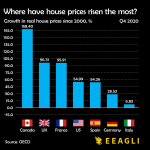
- Canada's Home Prices Have Risen 168.4% Since 2000, USA Home Prices Have Risen 54.99%01 Apr, 2021
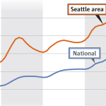
- Home Prices in Seattle Are Skyrocketing12 Mar, 2021
- Seattle Among Best Cities for Startups08 Jul, 2019
- Renters in Chicago and New York are fleeing south for Dallas24 Jun, 2019