Blog

Aug
Homelessness is an ongoing problem for many people and communities. Mental illness, poverty, domestic abuse, laziness—these are some common reasons people become homeless. Statista recently created the chart below which details the cities that have the highest number of homeless people.
 You will find more infographics at Statista
Interpreting the Numbers
A quick glance at the chart shows a shocking number of homeless people. Half a million people would fill ten major sports arenas! Digging a little deeper, however, shows that the number is comparatively small compared to how many people there are in the United States. The United States Census Bureau states that the population is just over 328 million. That means only 0.17% of people here are homeless. While the percentage is small, it’s still about 0.17% too much.
The Census Bureau also lists the most populous states. Four of them, in order, are California, Texas, Florida, and New York. How does this match up with our chart? Four of the ten are cities in California. New York, while only having one city in the chart (New York City), is by far the winner (or loser) when it comes to the highest number of homeless people that live in any particular state.
Percentages Against Total Number of Homeless
Statista lists the ten cities with the highest number of homeless. Adding those numbers will net 192,535 homeless people, which is nearly 35% of the total homeless in the United States. This makes sense since we learned earlier that California and New York, a couple of the most populous states, have cities with a high number of homeless people.
Let’s take a look at how the ten cities compare again the total number of homeless.
Total Number of Homeless: 553,742.
- Philadelphia: 1%
- Boston: 1.1%
- Las Vegas/Clark County: 1.2%
- San Francisco: 1.2%
- San Jose/Santa Clara City & County: 1.3%
- District of Columbia: 1.3%
- San Diego City and County: 1.7%
- Seattle/King County: 2.1%
- Los Angeles City & County: 10%
- New York City: 13.8%
What’s striking here is that most of the cities seem to have similar percentages. Statistically, Los Angeles and New York City see large jumps and can be considered the outliers of the sample. However, we need to take into consideration that those two cities are massively larger than the others in terms of size and population.
Percentages Against Total Number of Homeless Within Top Ten
Another way of looking at the data is to compare the numbers within each other. For this we won’t take into consideration the total number of homeless; however, we’ll use 192,535. As we learned earlier, that is the sum of the number of homeless from each of these ten cities. Here’s what we get:
- Philadelphia: 3%
- Boston: 3.2%
- Las Vegas/Clark County: 3.4%
- San Francisco: 3.6%
- San Jose/Santa Clara City & County: 3.8%
- District of Columbia: 3.9%
- San Diego City and County: 4.8%
- Seattle/King County: 6%
- Los Angeles City & County: 28.7%
- New York City: 39.7%
While Los Angles and New York City are still the outliers, this gives us a somewhat clearer picture of the data. The two large cities command roughly 68.4% of the total homeless within the top ten cities.

Featured photo by Pixabay and sleeping homeless man photo by Alvin Decena on Pexels
Aug
How does a neighborhood get its name? Often times, the political establishment will christen it. Other times, the residents of the area will name it. More recently, new names for neighborhoods have popped up on Google Maps. The New York Times recently dug a little deeper to find out why.
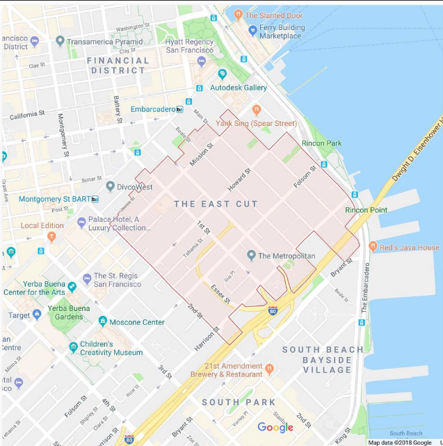
The East Cut
Imagine this: you live in the same neighborhood your whole life. Let’s say it’s called Old Town. Then, an acquaintance tells you to meet them down the street at an establishment in the “East Cut” neighborhood. You’ll have to ask for clarification because surely there’s no such place. The acquaintance pulls up Google Maps on their smartphone and proves it to you.
It may seem like the Twilight Zone to some; however, that’s exactly what happened earlier this spring. The New York Times writes “For decades, the district south of downtown and alongside San Francisco Bay here was known as either Rincon Hill, South Beach or South of Market. This spring, it was suddenly rebranded on Google Maps to a name few had heard: the East Cut.”
Typos and Mistakes
One would assume a platform like Google Maps would have precise spelling; however, that isn’t the case if the name submitted was misspelled in the first place. Arthur Mullen, a former city planner in Detroit, created a map as a side project back in 2002. His map, which was eventually posted online by locals, contained typos.
Timothy Boscarino, another city planner in Detroit, advised that Google Maps has incorporated Arthur Mullen’s map. “Google almost identically copied that map’s neighborhoods and boundaries, he said — down to its typos. One result was that Google transposed the k and h for the district known as Fiskhorn, making it Fishkorn.”
Here’s the problem with typos and mistakes: they spread from Google Maps to other online platforms. With regards to the East Cut, the “peculiar moniker immediately spread digitally, from hotel sites to dating apps to Uber, which all use Google’s map data. The name soon spilled over into the physical world, too. Real-estate listings beckoned prospective tenants to the East Cut. And news organizations referred to the vicinity by that term.”

How the Naming is Established
Google isn’t always clear with how they name or rename neighborhoods; however, we can presume that they do so with information already found online. This seemed to be the case after Arthur Mullen’s map appeared online.
The New York Times writes “The company declined to detail how some place names came about, though some appear to have resulted from mistakes by researchers, rebrandings by real estate agents — or just outright fiction.” The story of Jeffrey Schneider all but confirms this.
Jeffrey Schneider, an architect based in Los Angeles, owned a rental apartment. He wanted a new tenant so he ran some ads to make the available unit known. He decided, partly as a joke, to name his neighborhood “Silver Lake Heights”. In reality, the area he lived in was called only Silver Lake. Google Maps got a hold of the name ” Silver Lake Heights” and it began appearing on the platform.
Featured photo by Pixabay on Pexels
The East Cut map and photo are screenshots by RPS Relocation

Jul
Immigration to the U.S.—legal and illegal—is currently a hot topic in our political sphere. Both types of immigration happen on a daily basis. Another type of movement, domestic migration, also happens on a daily basis. As we’ll find out, the movement isn’t equal. Some states are gaining domestic migrants and other states are losing domestic migrants. We’re going to focus on the states that are losing migrants.
These are the states people don’t want to move to in 2018. In the chart below you’ll see some states shaded red which means the have a negative net migration, and some states shaded blue which means they have a positive net migration from current U.S. residents or citizens.
The Washington Post has detailed which states these are. They pulled the data from the best source: the U.S. Census Bureau. The data does not consider international immigration; however, the information is interesting nevertheless. Currently it would appear that U.S. residents are moving away from California, New York, Illinois, New Jersey, Michigan, Ohio, Pennsylvania, and Connecticut.
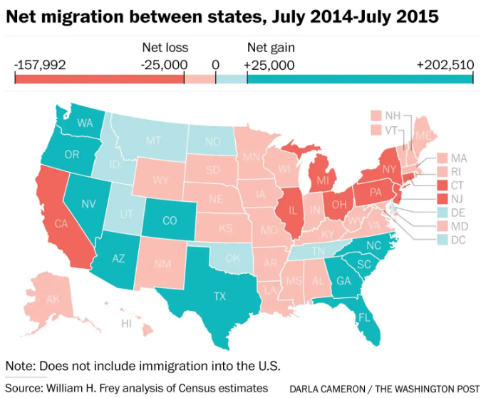
Let’s take a closer look at the top three states people seem to be fleeing from: California, New York, and Illinois.
California
California is surrounded by Oregon, Nevada, and Arizona. As you see in the picture, California is red and the other states are blue. It seems as if migrants from California are jumping the state line in support of one of the neighboring states or moving elsewhere across the country. In an earlier post we showed how Californians were moving to places nearby like Nevada and and to states further away like Texas, New York, and Georgia.
New York
New York, a state in the northwest, is surrounded by other states people are migrating from. If we only take into consideration domestic data, it would seem like the population as a whole is getting smaller in New York. Taking international immigration into account gives a better picture, however. “For states like New York, domestic migration losses are offset by new immigration from abroad.”
Illinois
Like New York, Illinois is also surrounded by states U.S. residents are migrating away from; however, neighboring states have less of an outflow than that of the state of Illinois. “Illinois, meanwhile, had a net loss of about 105,000 residents, its largest one-year population leak in the 21st century.”

Similarities of California, New York, and Illinois
Why are people leaving these states? Or, perhaps the better question is this: why aren’t people moving to these states? The answer could be in the cost of living.
According to USA Today, California and New York both make an appearance on the list of seven most expensive states to live in. They write the “median home value in the sunny state is $429,000, and homes generally list for a median price of $425,000 ($256 per square foot).” New York is even more expensive. They continue “New York is known for its higher cost of living, with median home prices sitting at around $525,000 ($507 per square foot). The real estate market in the Big Apple is hot, as statewide housing values have risen 8.5% over the past year, according to Zillow.”
Illinois didn’t make that list; however, which could be because most of the state is farmland. Most of the population in Illinois lives in urban and surrounding suburban areas. Chicago is the largest city in the state. According to Inc., Chicago is listed as one of the ten least affordable cities in America. They write “The cost to live comfortably here is $68,670 [per year] more than $15,000 a year less than New York or LA”. This should come as no surprise as to why people are leaving the city of Chicago of lower cost living in other parts of the country, therefore giving the State of Illinois a negative net migration.
Both Los Angeles and Chicago, the biggest cities in California and Illinois, also share a dubious distinction in that the Washington Post recently added both to a different list, a list of cities were murders are most likely to go unsolved. Los Angeles has been improving but the report said there are still large pockets were murders go unsolved like Pico-Union. Chicago was named as one of the top 2 cities where murders would go unsolved according to the report. There’s no way of knowing how much this impacts net domestic migration figures for two of the largest cities in America or how much unsolved murders in these big cities impacts an entire state’s net domestic migration.
Featured photo and Chicago photo by Pixabay on Pexels

Jul
There are thousands of towns, counties, and cities in America; but not all of them will be considered the best. “Best”, as a term, is quite subjective. Different people will have unique opinions as to what they consider the best cities. Often times, their answers will be related to their own past experiences.
In order to get more objective results, certain criteria should be offered. In addition, the criteria should be judged by an authoritative source. Best Cities has stepped up to the plate in this regard. Let’s take a look at their criteria and then see what cities they view as the best in the nation.
Criteria for the Best Cities
Best Cities has described the categories used in their methodology. “The ranking evaluates each qualifying city across the six pillars of place equity: Place, Product, Programming, People, Prosperity, and Promotion.” Having so many categories allows for better final results.
Place refers to the quality (crime, air quality, etc) of the city. Product refers to the city’s institutions, attractions. and infrastructure. Programming refers to the city’s arts, culture, entertainment. and culinary scene. People refers to the immigration rate and diversity of a city. Prosperity refers to the city’s employment and unemployment rate. And Promotion refers to the number of stories, references and recommendations shared online about a city.
Best Large Cities
Best Cities lists 50 of their favorite large cities based on their criteria. Large cities are those that have “metro populations of a million people or more.” For brevity, we’ll list the top 10. They are:
1. New York
2. Chicago
3. Los Angeles
4. San Francisco
5. Las Vegas
6. San Diego
7. Houston
8. Miami
9. Seattle
10. Boston
These cities are among the most recognizable in the country. New York, Chicago, Los Angeles, Miami—these cities are icons of American metropolitan areas. Chicago scored a perfect score when it comes to New York has a perfect score in the Place, Programming, Prosperity, and Promotion categories. Furthermore, New York has a near perfect score in the Product category. It’s no surprise then why it came in at first place on the list. Although Washington, DC is the capital, New York City is revered as the “Empire State” due to its wealth and resources.

Best Small Cities
Best Cities also lists 50 of their favorite small cities. Small cities are those that have “metro populations under a million people.” Again, we’ll list the top 10 in this category. They are:
1. Honolulu
2. Omaha
3. Albuquerque
4. Charleston
5. El Paso
6. Reno
7. Tulsa
8. Madison
9. Myrtle Beach
10. Asheville
The cities that are on this list are much less recognizable. Asheville, El Paso, Madison—these cities are relatively unknown to many people in America. Some of them, like Asheville, score highest with the Product criteria. Asheville is known for its universities, festivals, and other year-round events. In another example, Honolulu has a perfect score in the Place, Programming, and Promotion categories. It’s no surprise that Honolulu has a perfect score with Place, seeing as how the city has some of the most beautiful beaches and landscapes in the world.
New York City Photo by Lukas Kloeppel and Honolulu Photo by Tyler Lastovich on Pexels

Jul
What time zone do you live in? Depending on where you’re planning moving, you might end up in a different time zone. Moving to a neigboring time zone shouldn’t be too difficult; however, moving to a farther time zone may require some adjustment, especially when it comes to your sleep schedule.
A Reddit user, u/ptgorman, recently shared the time zone visualization shown above. It details the time zone of American cities with a popular of over 100,000 people. The data was pulled from Wikipedia’s List of United States cities by population. Reddit users have commented on the thread. Let’s take a look at what they wrote.
Common and Outlying Zones
Pacific, Central, and Eastern times are the most popular time zones. The number of cities in each is similar to each other. The cities in Mountain time are numbered less than half of the most common zones. Hawaii, Alaska, and Atlantic time zones can be considered the outliers of the data. Each of those three has five or fewer cities with a population of over 100,000 people.
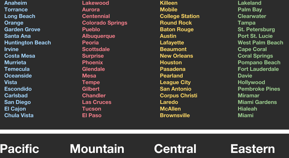
Texas and Time Zones
As Reddit user, u/sertorius42 says, Texas has many cities with a population over 100,000 people. They counted 14 in the Dallas-Fort Worth area; however, another Reddit user, u/Bonesaw823, quickly corrected u/sertorius42, advising the Dallas-Fort Worth area actually has 15 cities with a population of over 100,00 people.
Texas has two time zones: Central and Mountain Time. Most of the state is in the Central Time Zone. Only two counties—Hudspeth and El Paso—are in the Mountain Time Zone. These two are the western Texas counties.

Total Population of Time Zones
If you look at each time zone’s total population, the visualization would look very different. For example, the number of cities in Pacific, Central, and Eastern Time Zones with a population of over 100,000 people are similar; however, most of the general population lives in the Eastern Time Zone. It will probably stay like that for a long time.
U/ptgorman also shared relevant information about where the total population lives. In terms of total population, the Eastern Time Zone has 47.6%, the Central Time Zone has 29.1%, the Mountain Time Zone has 6.7%, and the Pacific Time Zone has 16.6%. This data comes from the 2015 Census estimates (via MetricMaps). So, if the visualization showed time zones by percentage of the population, Eastern Time Zone would show more than the others.
Given this information, another Reddit user, u/TradinPieces, expressed surprise that more Eastern Time Zone cities weren’t on the list. This makes sense for a couple reasons. One is that the population was able to grow on the eastern part of the country over the past few hundred years. The eastern part is where most of the historical immigration originated. Another is that, if a great part of the population resides on the eastern side, one would imagine there would be a high number of cities where the population is over 100,000 people. This just goes to show that data visualizations can be surprising and are a great and fun way to learn.

Featured Image by Kaique Rocha on Pexels

Jul
Californians are leaving! Well, not all of them are; however, there are a few reasons native Californians are looking to live elsewhere. KERA News, an organization based in Texas, dug a little deeper as to why some Californians are relocating. Their article details why some are moving to parts of Texas and other places.
Home prices in many areas of California are expensive. “It’s clear from the median home prices why Californians are moving to North Texas. Homes on the market in the four coastal California cities averaged $720,000 in March 2017, compared to $313,000 in Dallas.” The average home prices in those four cities are double the average home price in Dallas! It’s no surprise, then, why some people in California are moving.
Top Ten Cities for Emigration
Where else are Californians moving to? KERA News listed additional cities, which they pulled from a Trulia article. The cities, as you’ll soon read, are literally scattered all over the United States. The top ten cities Californians are moving to, in order, are:
- Las Vegas, Nevada
- New York, New York
- Phoenix, Arizona
- Dallas, Texas
- Seattle, Washington
- Portland, Oregon
- Atlanta, Georgia
- Houston, Texas
- Chicago, Illinois
- Denver, Colorado
Do you see any cities on the list that are surprising? Three of them, New York, Seattle, and Chicago, stand out. This is because these three cities aren’t known for affordable housing as much as a city like Dallas. New York City has some of the most expensive homes in the country.
KERA News continues, “Dallas and Fort Worth had among the largest population gains last year. On the list of 15 cities nationwide with the most population growth, Dallas’ increase of 18,935 people put it at No. 3, and Fort Worth was No. 4, with an increase of 18,664.” Again, the focus is on cities in Texas due to their job opportunities and lower cost of living.
It’s important to highlight Seattle, Dallas, and Houston specifically. According to Curbed, more homes are coming to the market in what has been a slim housing market as of late. “In the Seattle city limits in June 2018, NWMLS saw 1,246 active listings, a 75.5 percent increase from the year before.” Dallas and Houston are also highlighted because their real estate market is getting hotter as well.

The New Tax Law
The Tax Cuts and Jobs Act of 2017 contained more than tax cuts. It also closed some tax loopholes and established some deduction ceilings. The tax law became effective January 1, 2018. Therefore, many people don’t really know how it will affect them yet. They’ll find out next April when they submit their taxes.
Here’s what I’m getting to: there is a maximum deduction for state and property taxes. The magic number is $10,000. Let’s say a homeowner in California paid $15,000 in property taxes each year. Now, with the new tax law, they will not be able to deduct that extra $5,000 from their taxes. It makes financial sense for people with expensive homes and high property taxes to move to an area with lower home prices and property taxes.

Featured Photo by Bella Co and Dallas Photo by Pixabay on Pexels
Congress Photo by Wikimedia Commons on Wikipedia

Jul
Not all killers get caught. In a chilling reminder that some haneous crimes go unpunished The Washington Post recently conducted an in-depth study about areas where murders go unsolved. Their findings were surprising. They “mapped more than 52,000 homicides in major American cities over the past decade and found that across the country, there are areas where murder is common but arrests are rare”. Why? Let’s take a look at a few cities from the study.
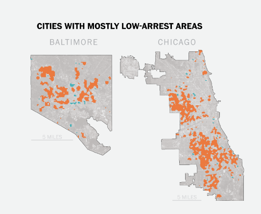
The study found that Chicago and Baltimore are the two cities with the most areas with high volumes of unsolved murders.
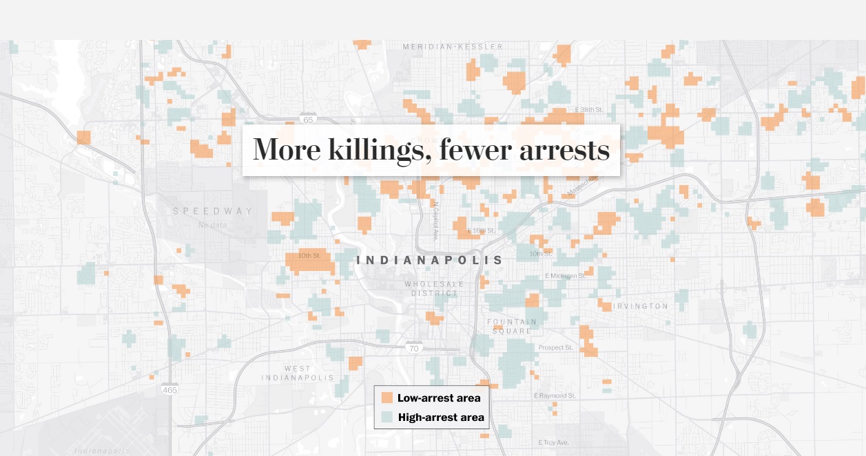
Indianapolis
There are some cities around the country that have a higher number of unsolved murders. Indianapolis — a place with a high murder count and a low arrest count — is one of these cities. In Indianapolis, “only 64 of the 155 criminal homicides last year resulted in an arrest”.
What’s more interesting, and which you can see from the photo below, is that Indianapolis has scattered areas of low arrests versus high arrests. Arrests for murder in the city aren’t contained to one or even a few general areas. They happen all throughout the city.
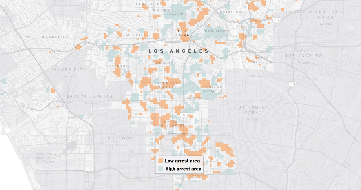
Los Angeles
Other cities around the country have seen a decrease in the number of killings. “In sprawling Los Angeles, police are proud of their homicide statistics over the past decade. The number of killings has dropped annually, and more than half of the 2,200 homicides since 2010 have led to an arrest, which is slightly better than average for cities surveyed.”
According to L.A. Police Captain Billy Hayes, “there are so many gangs in the city”. Gangs are normally associated with drugs, murder, and a host of other serious crimes. Therefore, having the police target gangs would likely lead to a decrease in the crime rate.
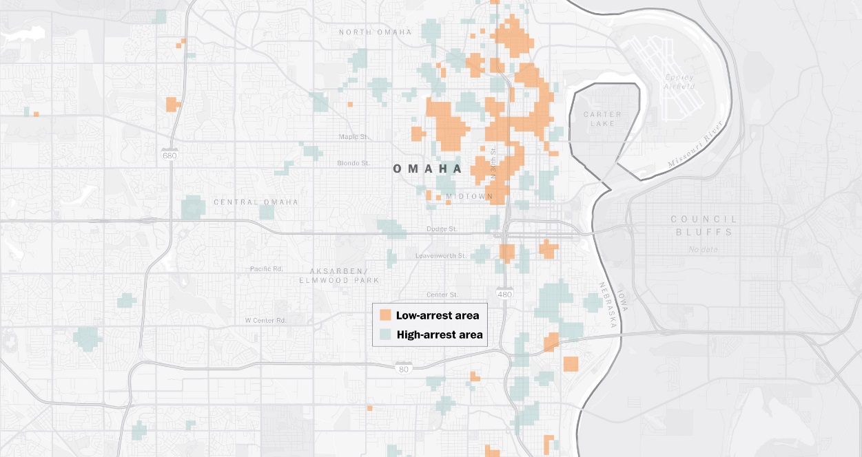
Omaha
Omaha, Nebraska. For many people, farmland and good old-fashioned American living is the first thing that comes to mind. We don’t associate the Heartland of America with gang murders. Even more shocking is what a former Omaha police chief said about crime in and around the city. Thomas Warren said “in many cases, these are not innocent victims. Unfortunately, you’re not going to get a lot of cooperation if the victims themselves were involved in gang activity or drug distribution.”
Challenges and Solutions
Police face numerous challenges when pursuing an arrest of a suspected murder. One challenge is that they need to have a lead. If the police don’t have a good relationship with the community, it will be difficult for them to gain information from their local public.
“Police blame the failure to solve homicides in these places on insufficient resources and poor relationships with residents, especially in areas that grapple with drug and gang activity where potential witnesses fear retaliation.” This makes perfect sense since many murders are gang-related. Very few people want to talk with the police out of fear they’ll be targeted by the gang. Detectives, however, say that community engagement is the key to solving and preventing murders and other criminal acts.
Featured Photo by Kat Wilcox on Pexels

Jul
Millennial Movers are heading to Washington and Texas in droves
Jason C. 0 comments Dallas, Moving News, Seattle
Birds of a feather fly together. The same can be said of Millennials. That’s because they are flocking to the same cities around the country in large numbers. Now, we have hard data of where they’re moving to, courtesy of SmartAsset. As you know from the title, Millennials are moving to Washington and Texas. Where else are they moving to? Keep reading to find out!
Top Ten States
We listed Washington and Texas specifically because they are the top two states Millennials are moving to. Here’s the full list:
- Washington – 39,590
- Texas – 33,650
- Colorado – 26,547
- Virginia – 18,338
- Georgia – 17,621
- Oregon – 11,989
- North Carolina – 9,647
- Nevada – 8,820
- Florida – 7,195
- Arizona – 7,077
And there you have it. These are the most popular states that Millennials are migrating to. The number to the right of the state indicates net migration.
Why are Millennials moving to those states? And why are they moving away from cities like Chicago and New York? Jobs, housing, and the cost of living are among the biggest reasons. Business is booming in states like Texas and in cities like Dallas/Fort Worth, for example.
Methodology of the Data
Where did the data come from? Derek Miller of SmartAsset writes, “In order to calculate which cities and states millennials are moving to, SmartAsset compared 2016 Census Bureau migration data for 217 cities and all 50 states, plus Washington, D.C. We compared the number of persons between the ages of 20 and 34 who emigrated from each city and state to the number who immigrated. We ranked the cities and states by highest difference between the number who immigrated and the number who emigrated for persons ages 20 to 34.”
And there you have it. The data comes from the Census Bureau which is probably the best place to get it from. The ages of between 20 and 34 are the target ages for Millennials which proves that the data has merit. Furthermore, the use of migration data for 217 cities shows that the study is a comprehensive one.
Unless cities like New York and Chicago take action to attract Millennials, those cities will eventually get smaller if people came moving away from them.
Featured photo by StockSnap on pixabay

Jun
Map Using Google Search Data Reveals The Most Popular Exercise Activity in Each State
Jason C. 0 comments Maps
There are numerous benefits to exercising. Energy levels, weight loss, skin health—each of these are improved by exercising. In addition, exercise is said to increase brain health, improve mood, and reduce the risk of chronic diseases. One has to wonder why more people don’t work out. There are reasons for that too, such as limited time or a lack of motivation. Some people also go through phases, working out for a period of time and then going on an a hiatus from exercise.
When someone wants to exercise they can choose from a large number of activities. Some of these activities include jogging, swimming, yoga, and hiking. Fitness Equipment Source recently put together a list of the most popular exercises in each state. The website used Google AdWords Keyword Planner Tool to collect the data. They also listed the 14 most popular exercises by keyword search volume on Google. They are:
1. Yoga
2. Running
3. Hiking
4. CrossFit
5. Swimming
6. Kayaking
7. Gymnastics
8. Cardio
9. Bodybuilding
10. Weightlifting
11. Aerobics
12. Mixed Martial Arts (MMA)
13. Martial Arts
14. Jogging
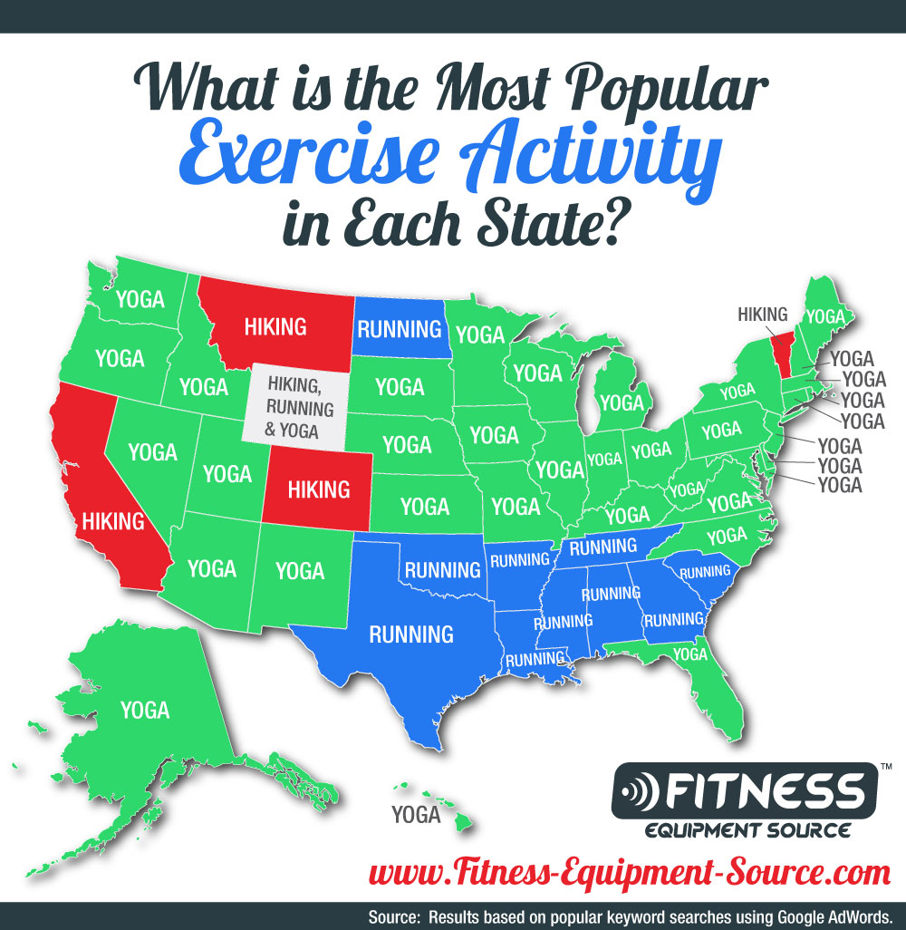
Hiking, Running, and Yoga
As you can see from the picture, and the list, hiking, running, and yoga are the most popular exercise activities. They are also the most popular activities in each state. Strangely enough, one can see a type of pattern with the geographical locations of yoga states versus running states. Yoga seems to be more popular in the middle and northern states while running seems to be more popular in the southern states.
North Dakota is the only northern state where running is the most popular exercise search keyword. On the other hand, Florida is the only southern state where yoga is the most popular exercise search keyword. Interestingly enough, yoga is the most popular exercise search term in Alaska and Hawaii. There are only four states which have a majority of “hiking” as the exercise keyword: California, Colorado, Montana, and Vermont.
Residents of Wyoming either can’t decide which exercise they love most or enjoy exercising so much they listed all three top exercises, as seen in the photo.
Top Exercise Activities by Volume
Each of the activities listed has a “most popular state” for it. That doesn’t mean it’s the most popular activity in that state overall. Even though hiking is the most popular search term in California, the state also has the highest search numbers for “running”. This is probably because there are so many people in California. Let’s talk about some other exercise activities on the Top 14 list.
“Swimming had had 117,390 related keyword searches with the highest per capita rate in the state of New Jersey. Kayaking had 93,500 related keyword searches and is most popular in Florida. Gymnastics reigns supreme in Texas with 64,430 related keyword searches.”
It’s not surprising that kayaking is most popular in Florida. After all, most of the state is surrounded by water and it has numerous rivers running through it.

Featured Photo by Chevanon Photography on Pexels

Jun
Worst USA Airports
Jason C. 0 comments Maps
Worst and best US airports by the numbers [OC] from dataisbeautiful
When you pay for a service you expect a seamless experience. That isn’t always how it is when it comes to flying on an airplane. Flight delays are a recurring theme at many large-scale airports around the country. Let’s take a closer look at the worst USA airports, ranked by delays.
A Reddit user, u/divergentdata, recently put together a video detailing the worst airports for delays. This information was shared on Reddit and many other Reddit users commented in the thread.
Total Versus Percentage
It’s important to understand the difference between total delays in an airport and total delays by the number of flights that transit an airport. Reddit user u/uddermann summed it up nicely. The total delays in order are “1. Ohare 2. Hartfield Atlanta 3. San Francisco 4. Dallas 5. Los Angeles 6. Newark Liberty 7. Philadelphia 8. Charlotte Douglas 9. LA Guardia 10. JFK”.
U/uddermann also chimed in on the top ten delays by transit percentage. They are “1. Memphis 2. Palm Beach 3. Dallas Love Field 4. Chicago Midway 5. Philadelphia 6. Bob Hope 7. Richmond 8. Baltimore/Washington 9. LA Guardia 10. Southwest Florida 11. Ronald Regan”. What this means is that, even though airports such as Memphis or Palm Beach aren’t large, they still have a large amount of delays flights, percentage-wise.
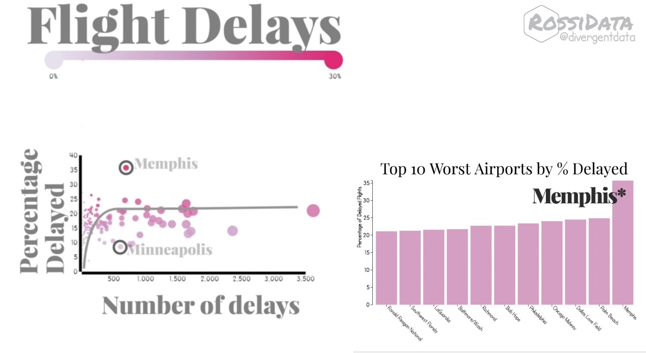
Airport Stories
Many Reddit users expressed frustration about traveling through some of the airports shown above. U/yeerk_slayer says “Chicago Suburbian here. I can confirm that almost all of my flights leaving O’Hare are delayed for one reason or another. But then again, we do have some pretty sporadic weather.” I have flown to and from Chicago in the past and can personally confirm that there are plenty of delays at O’Hare and Midway.
Minneapolis didn’t make the list. U/JMoc1 might be able to shed some light on that. He says “Minneapolis has the best clearing crews in the US. In fact, MSP is actually the training ground for all clearing crews and plowing services in the US”. U/JMoc1 is referring to clearing crews cleaning snow at the airport. Minneapolis is up north and gets quite a bit of snow.

Looking on the Bright Side
Although the main focus of the tread is airport delays, some Reddit users tried to see airports in a more positive light. For example, Reddit user u/Valiuncy said “if there’s one thing I like about Indianapolis, it’s our perfect airport. It’s so easy, clean, never too crowded, looks nice, and is everything an airport should be”. U/jrm20070 replied saying there’s “almost never a security delay [in Indianapolis]. I walk straight through without a line nearly every single time. I definitely take the airport for granted”.

Rumors on Causes for Delay
Constant delays in some airports have created some rumors in commentators. For example, u/raxitron said: “I think Memphis is the highest % delayed because it’s a hub for FedEx and their planes get priority over the small number of passenger flights”. Comments like these are only hearsay; however, one has to wonder if there is a link between commercial flights causing passenger flights to be delayed.

Featured Photo by Harry Knight on Unsplash
Most Recent Blog Posts
 A Dallas Area Home Buyer Had to Pay $300,000 More Than Asking Price For Their New Home22 May, 2021
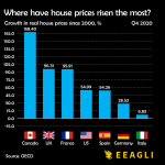
- Canada's Home Prices Have Risen 168.4% Since 2000, USA Home Prices Have Risen 54.99%01 Apr, 2021
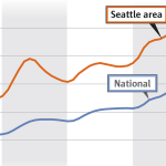
- Home Prices in Seattle Are Skyrocketing12 Mar, 2021
- Seattle Among Best Cities for Startups08 Jul, 2019
- Renters in Chicago and New York are fleeing south for Dallas24 Jun, 2019